Editorial Note: I may earn a commission when you visit links that appear on my website.

The Seven Different Types of Infographics and When to Use Them
Think written blog posts are enough to keep your brand afloat? Think again. Once you understand the power of infographics – and more specifically the different types of infographics that you can create to meet your content marketing needs – you will begin to understand the power of data visualization and how it can feed your marketing.
Before we go down that road, let’s take a step back.
Content marketing experts predict that the industry will be a lot tougher. In an interview with Mention, Rand Fishkin of Moz says, “Marketing is going to be even more challenging than it is today. Content marketers are going to have to be more unique with the types of content they create.”
If you’re a well-established brand, investing in standout content types like videos, mobile apps, and even VR then unique content should be no problem. Smaller businesses, however, will have a tougher time keeping up.
Fortunately for small businesses, once you understand the broad definition of infographics, using different types of infographics in your content strategy doesn’t require you to have deep pockets.
Why Use Different Types of Infographics?
Infographics can be considered as the saving grace of small brands in content marketing. Not only are they more affordable than videos, they are also very effective for stirring engagement in social media platforms.
Different types of infographics utilizes several visual elements to present information. However, it is up to you to choose the elements that best fit the information you wish to convey.
Without further ado, below are the 7 different types of infographics and the best way to use them:
1. Timelines
Visual elements are perfect for inducing certain emotions in your social media audience, which is why infographics are great for storytelling.
If the story you want to tell involves multiple events or changes over time, then you should use a timeline. From a reader’s perspective, these infographics are easy to understand because they follow a single flow.

Here is a simple example of a timeline infographic on the evolution of mobile phones:

When to Use Timeline Infographics
Timeline infographics are appropriate if you want to discuss the evolution or history behind something. Just remember to keep the time frames consistent to avoid confusing the audience. For example, if you already marked the first event to have occurred in 1990, then you shouldn’t use a different measure of time such as hours, months, or days for other events.
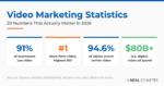
2. Data Visualizations
A popular way to use infographics is to visually represent complex data. Through data visualization, dense information can be shared with the audience faster and more efficiently. They also make it easier for the audience to remember the information.
However, data visualization can be tricky since information can be presented in multiple ways. The key is to determine the best visualization that will get your point across.
For example, if the information can be organized into three categories, then a Venn diagram can be used:

When to Use Data Visualization Infographics
This type of infographic is quite flexible. There are several visualization types you can use – from bar graphs to pie charts. Of course, you can use a combination of these, especially when covering data-rich studies.
3. Anatomy
Using visual elements is a great way to break down technical information, making it easier for the audience to comprehend. Use an infographic that breaks down information into its core components.
For example, a Progressive Web App is not something you normally hear about. To help you understand it in the quickest way possible, this infographic explains its anatomy in a visual way:
When to Use Anatomy Infographics
Anything that can be explained by looking into its anatomy can be represented using this infographic type. This includes car engines, computers, animals, or even something abstract – like a strategy or mindset.
4. Processes and How-To’s
A process is quite similar to a timeline. They both follow a single flow and are typically accompanied with directional cues like arrows and numbers.
There is, however, a key difference between the two. Unlike timelines, processes do not depend on the progression of time. They focus on the actual events instead of when they occur.
Here is an example:
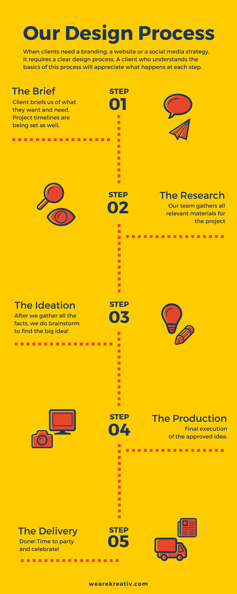
When to Use Process Infographics
Explainer videos do a similar job with process infographics, but the latter are more accessible and easier to share. Infographics that focus on the “how-to’s” of a process can better relay instructions than long-form text.
Is LinkedIn Actually Bringing You Business?
My latest book helps professionals, entrepreneurs, and business owners turn LinkedIn from a static profile into a real source of clients and growth.
Maximizing LinkedIn for Business Growth gives you clear, practical steps to build a profile that gets noticed and a network that actually sends business your way.
Grab your copy on Amazon and put it to work this week. Click the cover or the button below to get started.

5. Comparisons
While some comparisons can be done via simple data visualizations, it’s better to create an infographic that draws further distinctions
Besides, rather than using a single visualization to or infographic compare , doing a comparison infographic also means you can utilize different elements such as charts and tables. This allows you to perform comparisons in more creative ways.
Here is an example of a comparison infographic:

When to Use Comparison Infographics
This infographic is useful if you want to compare two or more things. You are free to include as much information as you want as long as they belong to one of the groups being compared. Since there is no limit to the number of things you can cover, use comparison infographics for buyer’s guides that help your audience compare multiple products.
6. Lists
Whether you’re writing an article or creating an infographic, organizing information in a list will improve the experience of your audience. Lists make it easier to skim content, which is useful if viewers want useful information quick.
Unlike process and timeline infographics, the items in a list infographic do not follow a specific order – with the exception of “top” lists that arrange items based on a set criteria. Regardless, everything in a list must collectively form a cohesive thought or relate to a single topic.
Here is a simple example that’s about iPhone facts:
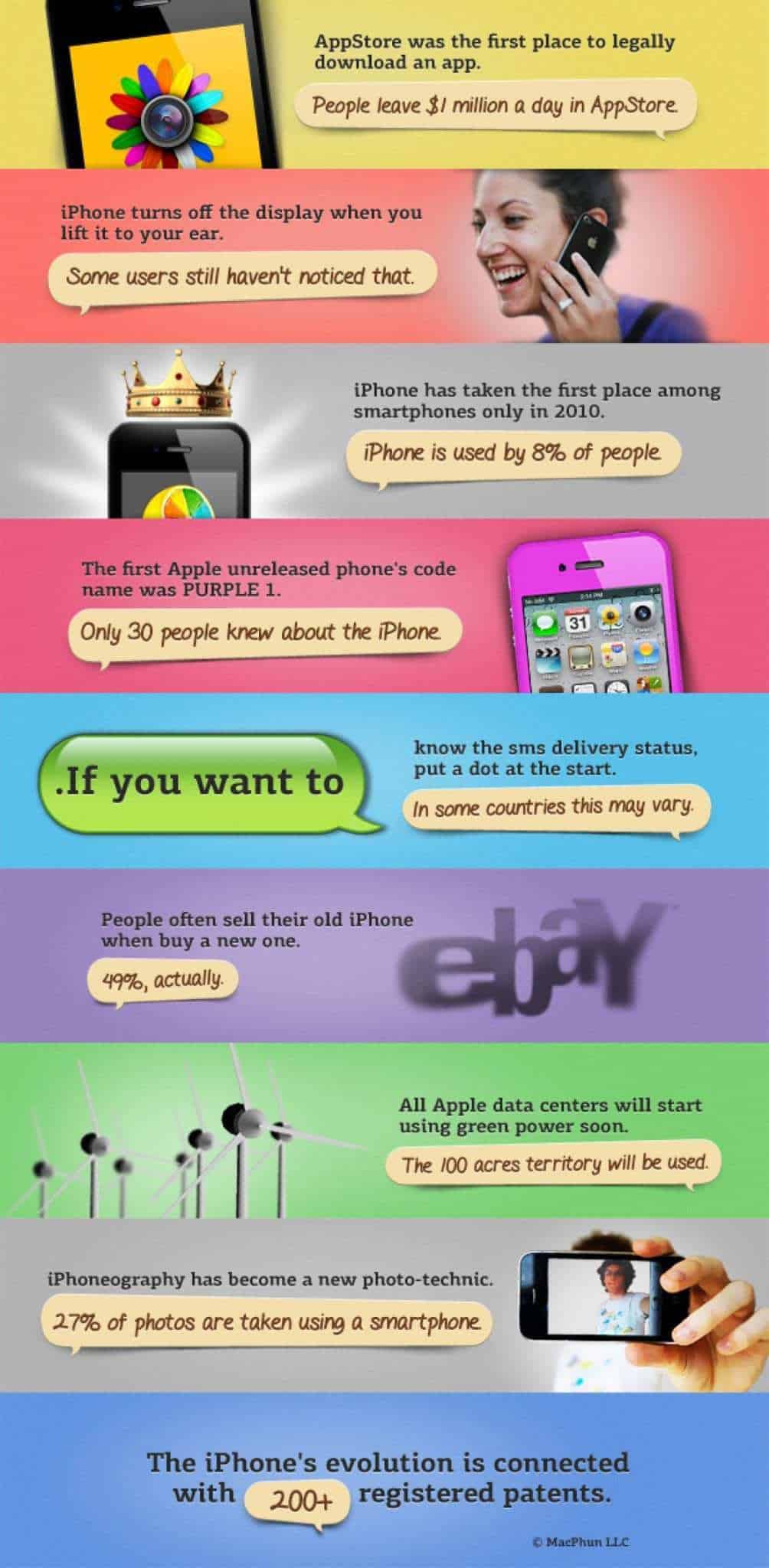
Infographic courtesy: Visual.ly
When to Use List Infographics
List infographics have numerous purposes such as enumerating quick tips and top lists. It is probably the simplest format for any type of content.
7. Maps
Map infographics are exactly what they sound like. They make it easy to share information tied to geological locations.
The visual elements you can use range from heatmaps, color codes, icons, and other data visualizations. Here is another simple example from Visual.ly:
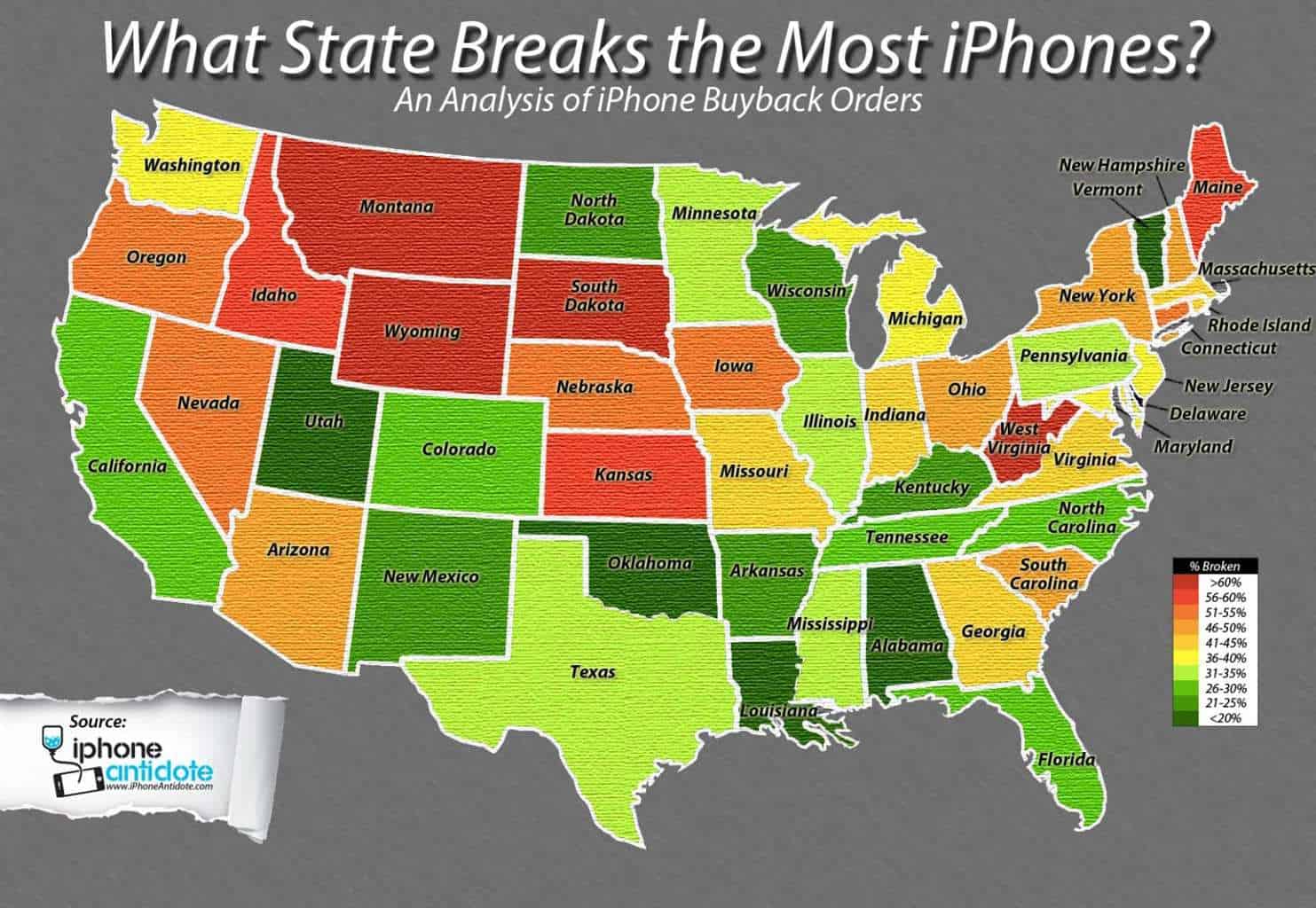
Infographic courtesy: Visual.ly
When to Use Map Infographics
Map infographics are great when it comes to presenting statistics, survey results, and other demographic data. The good news is, you don’t have to conduct your own data-gathering for this. There are plenty of publicized studies and surveys you can use to create something unique.
Final Words
Understanding the broad definition of infographics and Incorporating different types of infographics in your content strategy could be your ticket to successful marketing. Just don’t be afraid to diversify and explore other content types that will appeal to different audiences.
Actionable advice for your digital / content / influencer / social media marketing.
Join 13,000+ smart professionals who subscribe to my regular updates.

Vikas Agrawal
Articles: 22 Comments
Comments are closed.


Hello! I have a question!
What’s an Editorial Infographic?
Many thanks for this. I came back to your article it was so good and very useful