
I noticed this on my own account before I understood why. I opened my grid one day and my posts looked off, even though I had framed every one of them carefully when I posted. That gap between careful framing and how the grid actually rendered them is what sent me looking for answers.
For over a decade I have helped brands and creators build their social presence, and I wrote about visual-first marketing in my book Digital Threads. As an official Adobe Express Brand Ambassador, I also resize a lot of Instagram content. That is the background I bring as a digital marketing consultant and keynote speaker. So this is not another table of pixel dimensions. It is a decision. I will give you the exact sizes, tell you which one to pick, and show you how to fix the templates you already have.
The posts that rank for this term mostly stop at the numbers, and they disagree on the one thing that matters: whether 4:5 or 3:4 is now the right default. I will settle that, and cover what to do with the 4:5 library you already built.
Key Takeaways
✅ Instagram’s profile grid now crops every thumbnail to 3:4 (1080 x 1440 px), a change Instagram rolled out in January 2025.
✅ The feed still shows your post at whatever ratio you uploaded, anywhere from 1.91:1 landscape to 3:4 tall, per Instagram’s accepted range.
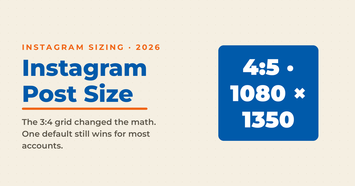
✅ My recommendation: design at 4:5 (1080 x 1350 px) and keep your important elements inside a centered 3:4 safe zone. Post native 3:4 (1080 x 1440 px) only for phone photos you want uncropped on the grid.
✅ A 4:5 post loses a thin strip from each side on the grid, cropping to a center area of about 1012 x 1350 px, which is why the safe zone matters.
✅ You do not need to rebuild your 4:5 template library. You need to re-center it. Move logos, text, and faces toward the middle so nothing important sits in the cropped edge.
What Is the Best Instagram Post Size in 2026?
For most accounts, the best Instagram post size is 4:5 portrait at 1080 x 1350 px, designed with a centered 3:4 safe zone. It fills more of the feed than square, matches your existing templates, and survives the grid crop when your key elements stay centered. Use native 3:4 (1080 x 1440 px) for uncropped phone photos.
That single rule covers most of what a business posts: quote graphics, educational carousels, product shots, and photos. The reason 4:5 stays the workhorse is that it takes up about 20% more feed space than a square while still fitting inside the taller grid tile. That extra height keeps your post on screen a beat longer, which is time the algorithm counts as attention. Square posts (1:1) still upload fine, but they now waste grid space and give up that edge.
Here is the full placement set, organized so every entry tells you when to use it rather than just handing you a number.
| Format | Size (px) | Aspect ratio | Use when |
|---|---|---|---|
| Portrait feed post | 1080 x 1350 | 4:5 | Your default for graphics, carousels, and most photos |
| Tall feed post | 1080 x 1440 | 3:4 | Phone photos you want to fill the grid with zero crop |
| Square feed post | 1080 x 1080 | 1:1 | You need one asset that also works on other platforms |
| Landscape feed post | 1080 x 566 | 1.91:1 | Wide or cinematic shots where horizontal framing is the point |
| Stories and Reels | 1080 x 1920 | 9:16 | Any full-screen vertical content |
| Profile photo | 320 x 320 | 1:1 | Displayed as a circle, so center your logo or face |
Instagram accepts feed photos between 1.91:1 and 3:4, sizes anything outside that down to fit, and caps served images at 1080 px wide. Uploading larger files only helps if you want maximum sharpness after compression.
What Changed With the Instagram Grid?
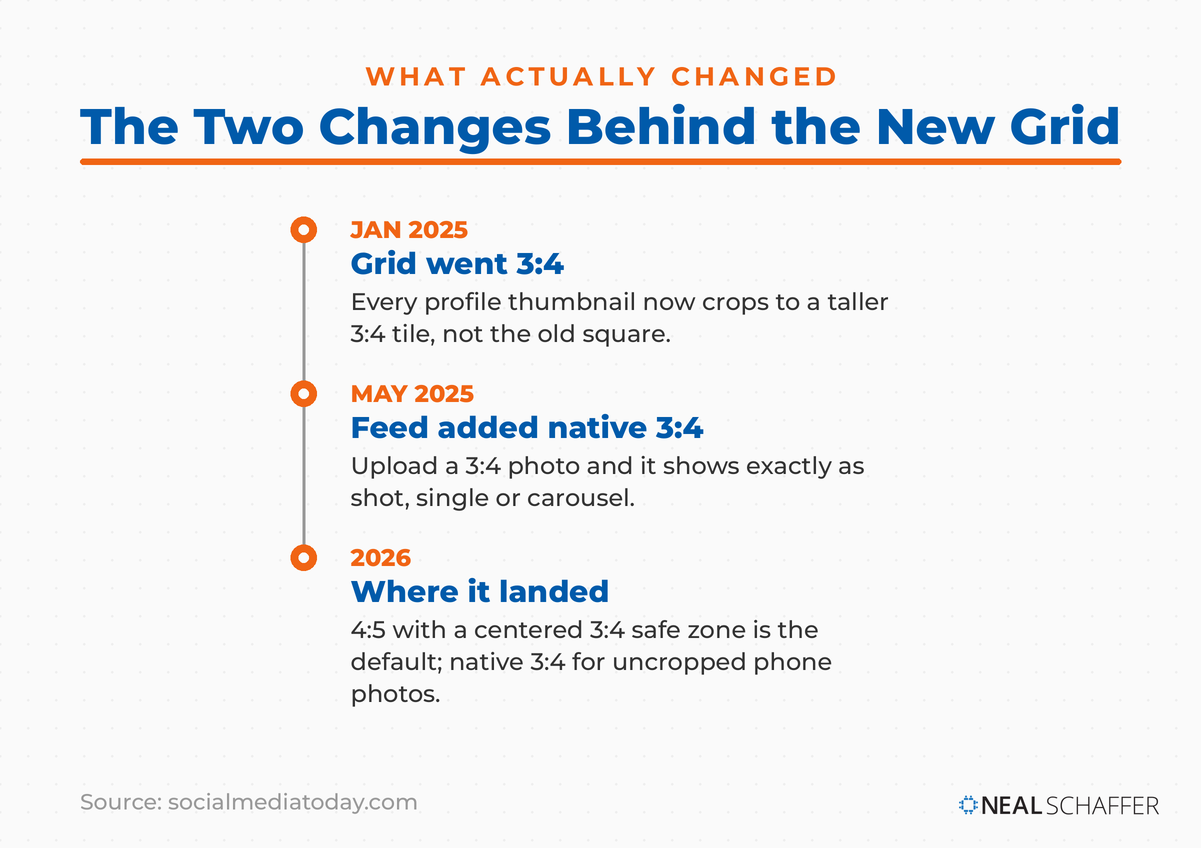
Instagram replaced its square 1:1 profile grid with a taller 3:4 grid in January 2025, then added native 3:4 photo support in May 2025. Your full-size posts still open at their original ratio, but every profile thumbnail is now cropped to 3:4. That is why square grids broke and why 4:5 posts trim slightly.
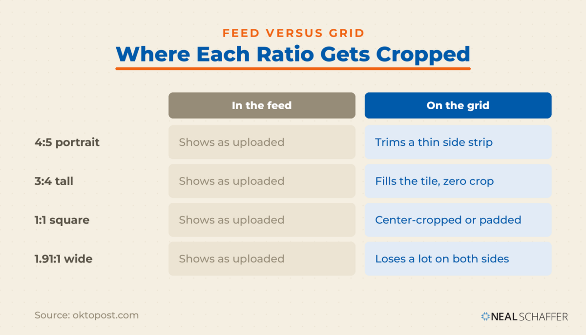
The grid and the feed behave differently, and that distinction is the whole story. In the feed, Instagram respects your framing and shows the post at the ratio you uploaded. On the profile grid, every thumbnail gets cropped to 3:4 no matter what you uploaded. A 4:5 image loses a thin strip from each side. A square image gets padded top and bottom or repositioned. A landscape image loses a lot on both sides. A Reel cover gets cut down from 9:16 to 3:4.
Adam Mosseri, the head of Instagram, tied the change to how people actually shoot, since almost every phone camera defaults to a tall 3:4 ratio. When Instagram added native 3:4 support, the platform told creators that “when you upload a 3:4 image it’ll now appear exactly as you shot it,” and that this works for both single photos and carousels. So 3:4 went from a grid-only shape to one you can post directly.
Want the underlying numbers on how vertical content performs and why the platform keeps pushing this way? The Instagram statistics I keep updated are worth a look. The short version: vertical won, and the grid change locked it in.
Should You Post 4:5 or 3:4 on Instagram?
Post 4:5 (1080 x 1350 px) as your default and design inside a centered 3:4 safe zone. Choose native 3:4 (1080 x 1440 px) only when you post an uncropped phone photo and want it to fill the grid exactly. Both fit the grid better than square. The choice comes down to template consistency versus zero-crop grid precision.
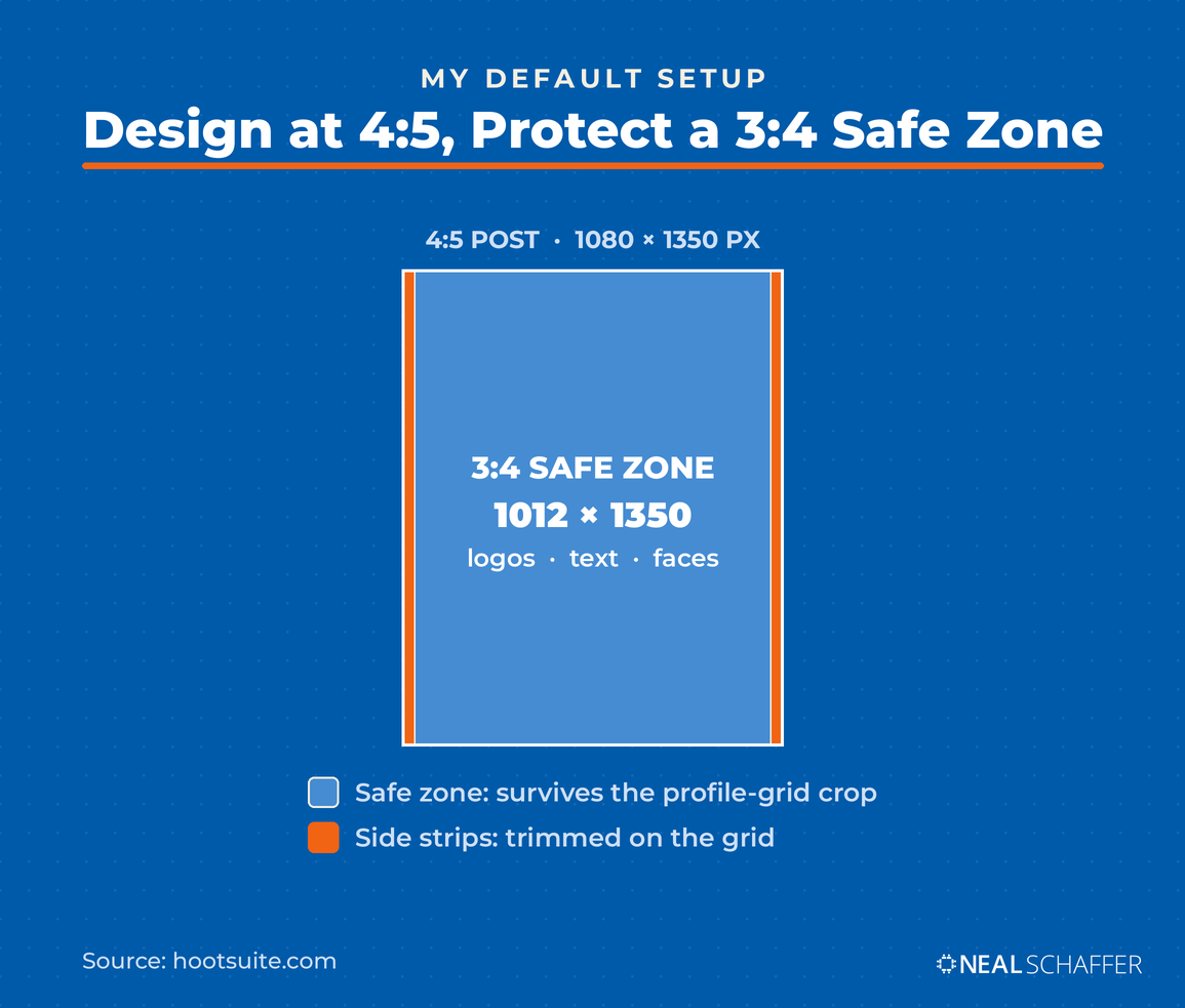
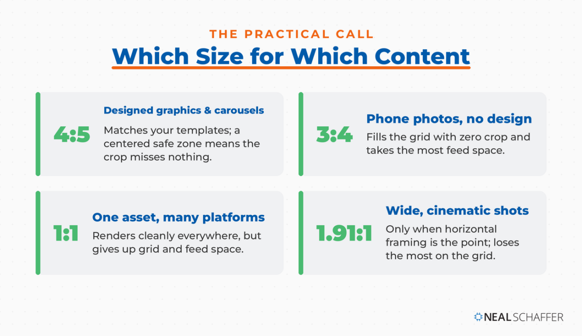
This is where the ranking posts split, so let me be direct about why I land on 4:5 for designed content. Your templates are almost certainly already 4:5. Your quote graphics, carousel decks, and promo images: all 4:5. Rebuilding that whole library at 3:4 to gain a perfectly filled grid tile is a lot of work for a small payoff. A centered safe zone solves the crop anyway. The grid trims a 4:5 image to roughly 1012 x 1350 px, so as long as your logos, faces, and text sit inside that center column, nothing important gets cut.
There is a good case for 3:4 too, and it is strongest for one job. A 3:4 post is slightly taller than 4:5, so it fills even more feed space and matches the grid tile exactly with no crop. If you shoot on your phone and post without heavy design work, default to 3:4 and skip the safe-zone math. A quick pass in an editor still helps those photos, and these tips to edit Instagram photos cover lighting, filters, and keeping a recognizable look. For templated content, the faster call is to keep your 4:5 system and center it. Use this to decide:
| Your content | Best size | Why |
|---|---|---|
| Designed graphics, carousels, quote posts | 4:5, 1080 x 1350 px | Matches your templates; a centered 3:4 safe zone means the grid crop misses nothing important |
| Phone photos posted without design work | 3:4, 1080 x 1440 px | Fills the grid with zero crop and takes the most feed space |
| One asset reused across several platforms | 1:1, 1080 x 1080 px | Renders cleanly everywhere, though it gives up grid and feed space |
One thing I would not do is go back to square. Square posts upload fine, but they waste the taller grid tile and give up feed real estate. If you still design everything at 1:1 out of habit, that habit is now costing you visibility. SocialBee puts it well: if you remember one size, make it 1080 x 1350.
How Do You Fix 4:5 Templates and Old Posts That Now Crop?
You do not rebuild your 4:5 templates. You re-center them. Move logos, headlines, and faces away from the left and right edges into the center 3:4 zone so the grid crop never touches them. For old posts, use Instagram’s Adjust Preview tool to reposition each thumbnail. For your template file, add a centered safe-zone guide once and reuse it.
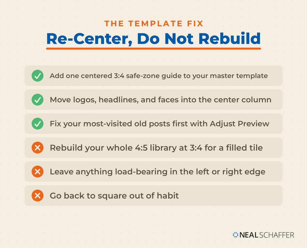
Start with the templates, because that is where the biggest win is. Open your master 4:5 template and add a guide marking the center 1012 x 1350 px region. Anything outside that column can be background, texture, or color, but nothing load-bearing. This is a one-time fix that protects every future post. In Digital Threads I make the case that consistency across every touchpoint is what builds a recognizable brand, and a cropped logo on half your grid quietly undermines that.
For the back catalog, Instagram gives you a manual fix. Open any post, tap the three dots, choose Adjust Preview, and reposition the image inside the 3:4 frame, or add a white or black border to letterbox a square. It is tedious across a large archive, so prioritize your most-visited posts and the ones a new visitor sees first.
If a key 4:5 graphic genuinely needs more height to work as a 3:4, that is a resizing job rather than a redesign. Generative expand tools can add matching background above and below an image to convert a 4:5 into a 3:4 without squashing the original, and I walk through the options in my post on AI image extenders. Use it sparingly, on the graphics that matter, not as a bulk migration plan.
How Do You Set Up the Right Size in Adobe Express?
Adobe Express makes this a two-minute setup. Start a project at 1080 x 1350 px for a 4:5 post, or 1080 x 1440 px for native 3:4. Add a centered guide for the 3:4 safe zone, keep your text and logo inside it, then resize to spin off 1080 x 1920 Story and Reel versions without rebuilding the design.
Make LinkedIn Your Best Source of Clients
My latest book helps professionals, entrepreneurs, and business owners turn LinkedIn from a static profile into a real source of clients and growth.
Maximizing LinkedIn for Business Growth gives you clear, practical steps to build a profile that gets noticed and a network that actually sends business your way.
Grab your copy on Amazon and put it to work this week. Click the cover or the button below to get started.

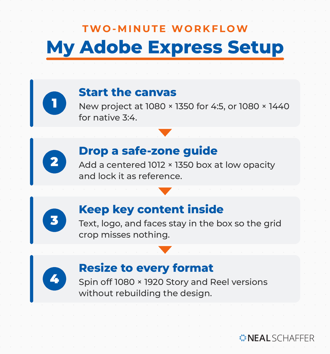
As an Adobe Express Brand Ambassador, this is the workflow I actually use and teach. The reason I reach for Adobe Express over Canva here is the resize step. One 4:5 design converts to 9:16 for Stories, 1:1 for cross-posting, and back again, which matters when a single campaign has to live across the feed, the grid, and Stories at once. Build the design once, keep the important content centered, and let the tool handle the ratio math. The one exception is a Stories ad. When the 9:16 version is the one carrying the budget, I build it first and derive the square from it, never the reverse. Cropping a square asset into 9:16 is the most common failure I call out in my breakdown of Instagram Stories ads examples.
The safe-zone trick is the part most people skip. Drop a shape at 1012 x 1350 px, center it on your 1080 x 1350 canvas, set it to low opacity, and lock it as a reference layer. Anything that has to survive the grid crop stays inside that box. I keep one master template built this way and duplicate it for every new post, so the safe zone is a decision I make once rather than every time I design.
What About Carousels, Stories, Reels, and Ads?
Carousels lock to the first slide’s ratio and allow up to 20 slides, so set slide one at 4:5 (1080 x 1350 px) and match the rest. Stories and Reels are full-screen 9:16 (1080 x 1920 px). Feed ads use the same 4:5 or 1:1 sizes as organic posts, and Stories and Reels ads use 9:16.
The first-slide rule is what catches people out. Whatever ratio you choose for slide one, Instagram forces every other slide to match, cropping any that differ. You can pack in up to 20 slides and mix photos and videos, but they all obey slide one. Design the whole deck at one ratio before you upload. For most accounts that ratio is 4:5, and you can learn the format specifics in my post on Instagram carousels.
Stories and Reels share the same 9:16 canvas at 1080 x 1920 px. Keep your text and stickers out of the top and bottom edges, where the username, caption, and action buttons sit. A Reel cover also gets cropped to 3:4 on your grid, so design the cover with its center in mind. The mechanics of each format live in my posts on Instagram Stories and Instagram Reels.
For paid, Instagram ad sizes mirror organic. Feed ads run at 4:5 (1080 x 1350) or 1:1 (1080 x 1080), Stories and Reels ads at 9:16 (1080 x 1920), and carousel ads follow the same first-slide rule. If you are boosting posts, matching the right size before you promote keeps your budget behind creative that fills the placement instead of getting cropped. I cover the mechanics in my post on how to boost an Instagram post.
Does Post Size Affect Reach and Engagement?
Post size does not directly change the algorithm, but it shapes the signals the algorithm reads. Taller portrait posts fill more of the screen and stay in view longer as people scroll, and longer dwell time is a signal Instagram rewards. Square and landscape posts take up less space and give up that edge.
The connection is indirect but consistent. A 4:5 or 3:4 post is physically larger in the feed, so a scroller spends a fraction of a second longer on it. Across thousands of impressions, that adds up. It is the same logic behind why the Instagram algorithm favors content that holds attention. Size is not a growth hack on its own, but posting square in 2026 is a small, avoidable handicap.
The bigger engagement levers are the caption and the timing, not the pixel count. Getting the size right just removes a headwind. If you want the parts that actually move the needle, my posts on Instagram captions and the best time to post on Instagram are where I would spend the energy once your dimensions are locked.
What Sizes Should You Use for Other Platforms?
Each platform has its own grid and safe zones, so one file rarely fits all. A vertical 9:16 video travels well across Instagram Reels, TikTok, and YouTube Shorts, but feed images and banners differ by platform. Build a 9:16 master for video, then resize static images to each platform’s feed and header specs rather than reusing one crop everywhere.
If you repurpose content across channels, the sizes that trip people up most are the profile banners and headers, since every network uses a different shape. For example, the LinkedIn banner size is nothing like an Instagram post, and dropping a square Instagram graphic into a LinkedIn header just looks broken. Treat each platform’s dimensions as their own thing, and lean on a resize tool so you are adjusting one design rather than starting over.
Frequently Asked Questions
Both work in the feed. The profile grid crops everything to 3:4, so 3:4 (1080 x 1440 px) fills the grid with zero crop, while 4:5 (1080 x 1350 px) trims a thin strip from each side. I recommend 4:5 with a centered safe zone for designed content and 3:4 for uncropped phone photos.
4×5, written 4:5, is a portrait aspect ratio where the image is 4 units wide by 5 units tall, which works out to 1080 x 1350 px. It is the format Instagram recommends for feed posts because it takes up more vertical screen space than a square without exceeding the supported range.
Neither is the feed default. Instagram accepts feed ratios from 1.91:1 landscape to 3:4 tall, and both 4:3 and 16:9 fall inside that range, so they post without cropping but show smaller than a portrait post. For video, Reels use full-screen 9:16, which is the tall version, not the wide 16:9.
For feed posts, 1080 x 1350 px (4:5) is the safest all-purpose size, with your key content centered inside a 3:4 safe zone. Stories and Reels are 1080 x 1920 px (9:16), and your profile photo is 320 x 320 px. If you shoot on your phone and skip design, 1080 x 1440 px (3:4) is the strongest single feed ratio.
Yes. Existing square posts still open at 1:1 when tapped, but their grid thumbnail is now center-cropped to 3:4. You can reposition the crop with Instagram’s Adjust Preview tool or add a white or black border so the full square shows inside the taller tile.
Get Your Instagram Sizes Right, Then Get Strategic
Set your feed default to 4:5 at 1080 x 1350 px, add a centered 3:4 safe zone to your template, and reserve native 3:4 for the phone photos you want to fill the grid. Fix your most important old posts with Adjust Preview, and stop designing new content as squares. That handles the dimensions in an afternoon.
Sizes are the foundation, not the strategy. Once your grid looks intentional, the next question is what to actually post and why. That is what my post on Instagram marketing is built for. And if you want a second set of eyes on how your visual branding fits your broader digital presence, that is the work I do as a Fractional CMO. You can also download a free preview of Digital Threads to see how the visual pieces fit the bigger picture.