
I opened Instagram on a Saturday night and started tapping through Stories. Friends at dinner. Somebody’s dog. A conference photo dump. Three separate people at the same concert. I kept tapping. Dozens of Stories later, I finally hit an ad.
One. In an entire session.
That’s the strange thing about this placement. Stories is where a huge share of the actual sharing on Instagram now happens. And yet the ad arrives alone, full screen, with nothing else on the glass competing for your eyeballs. No sidebar. No next post peeking up from the bottom. Just your thumb and one advertiser.
I’ve been teaching social media marketing at Rutgers Business School and writing about Instagram since it was a square-photo app. And I’ll say this plainly: way too many advertisers treat Stories as leftover inventory. So I screenshotted the ad I found and pulled it apart. That teardown is what this post is built around, along with the creative rules that apply only here.
Key Takeaways
✅ Stories carried 43% of all Instagram ad impressions in Q4 2025, a bigger share than Reels or Feed, so this placement is anything but empty.
✅ People post to Stories less often but engage more deeply, with replies up 88% year over year and exits down 6%.
✅ The format gives you one full screen, a few seconds, and a button you don’t design, which changes almost every creative decision.
✅ The best Stories ads look like Stories, rather than a repurposed square feed graphic with letterboxing.
✅ Interactive elements and replies are the real advantage here, because Stories is a conversation surface first and a broadcast surface second.
What Are Instagram Stories Ads, and How Are They Different from Feed Ads?
Instagram Stories ads are full-screen vertical ads that play between the Stories of accounts a person follows. They carry a “Sponsored” label and usually a tappable call-to-action button at the bottom. They occupy the whole screen for a few seconds, auto-advance when they finish, and disappear the moment the viewer taps forward.
That last part matters more than anything else in this article. A feed ad sits on a scrollable page and can be scrolled back to. A Stories ad is a moment. It plays, and then it’s gone, and the viewer’s next tap is already in motion.
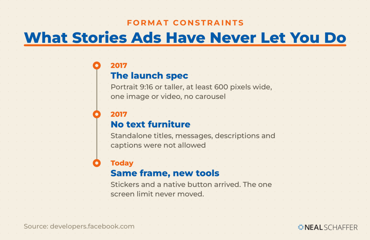
The format has been constrained by design since the beginning. When Meta opened Stories ads to advertisers, its own developer documentation spelled out the rules. Media had to be portrait at 9:16 or taller, video was capped at 15 seconds, and standalone titles, messages, descriptions, and captions were not allowed. TechCrunch reported that at launch the ads were not even clickable. A photo ran up to five seconds, a video up to 15, and viewers could swipe past at any time.
Instagram has added plenty since then. What hasn’t changed is the shape of the thing: one screen, a short window, and an interface Meta controls. Your creative lives inside their frame, and the frame isn’t negotiable. If you want the wider view of how paid fits alongside organic on the platform, that sits inside a broader Instagram marketing strategy rather than in the ad account alone.
Why Are Stories Where You Should Meet People on Instagram Now?
Stories is where Instagram’s remaining public sharing actually happens. Public feed posting has been declining across the industry while private and semi-private sharing grows. That makes the Stories tray closer to what the feed used to be: a look at what people you actually know are doing today.
Adam Mosseri, who runs Instagram, described the shift bluntly in an interview with Business Insider. On Instagram, he said, way more photos and videos are shared into stories than into the feed, and more still go into DMs. He also pointed out that feed and Stories are the surfaces Meta monetizes directly, which tells you exactly where the company’s attention sits.
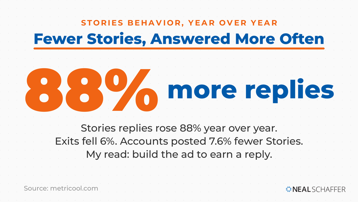
The behavior data lines up. Metricool’s 2026 study covered more than 24 million Instagram posts. Stories replies rose 88% year over year, exits fell 6%, and accounts published 7.6% fewer Stories overall. Fewer Stories, watched further, generating more conversation. That’s a placement getting healthier.
This is why I keep telling clients to stop treating Stories as the place their unused budget goes. People are still showing up daily to see what their friends are up to. Your ad shows up in the middle of that. It’s the closest thing paid social has to being handed the phone.
Two things follow. An ad that feels like a corporate billboard in that context sticks out badly. And an ad that earns a reply has done something a feed ad basically cannot do. If your organic side is thin, fix that too, because the Instagram Stories you post yourself set the expectation for what your paid Stories look like.
What Does a Real Instagram Stories Ad Look Like? A Teardown
A real Instagram Stories ad is a single vertical screen carrying one offer, one image, a Sponsored label, and a native button. The T-Mobile Fiber ad below is the one I hit in my own Stories in July 2026. It shows what the format rewards, and where advertisers still waste the screen.
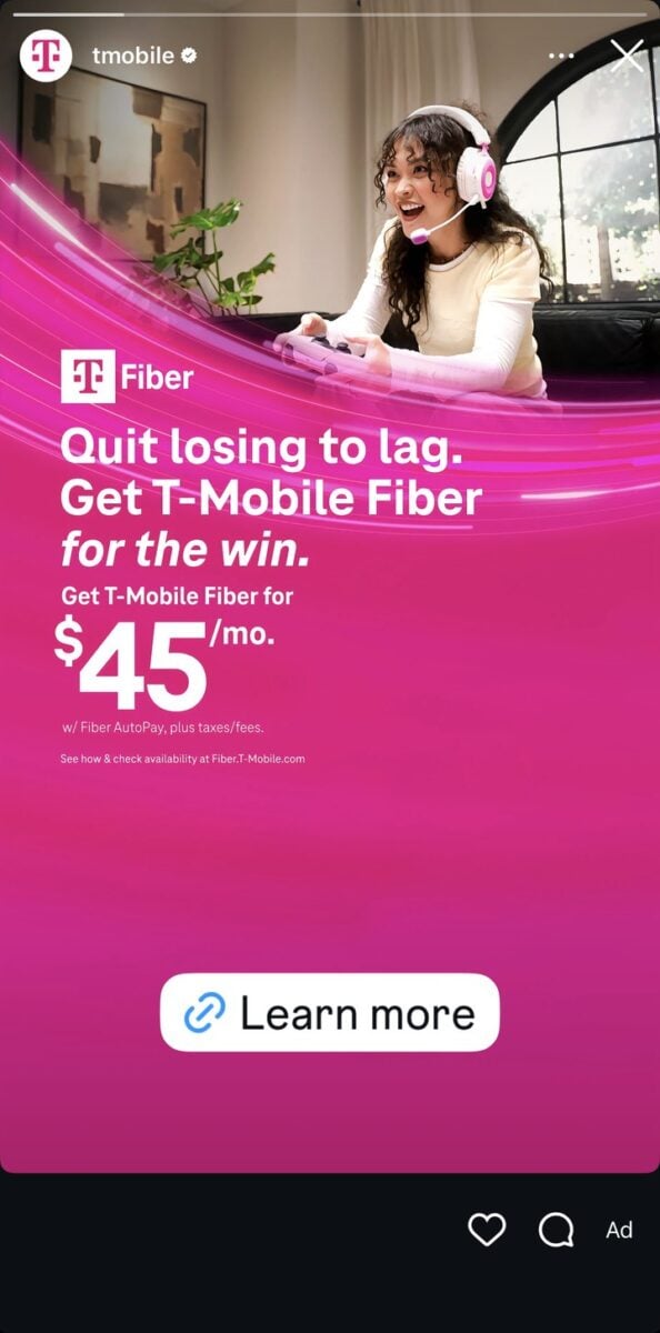
My honest first reaction: this is a blatant ad. There’s no pretending otherwise. It’s a saturated magenta brand field with a product name, a headline, a price, legal fine print, and a button. Nobody is mistaking it for their friend’s weekend.
And it still does several things right.
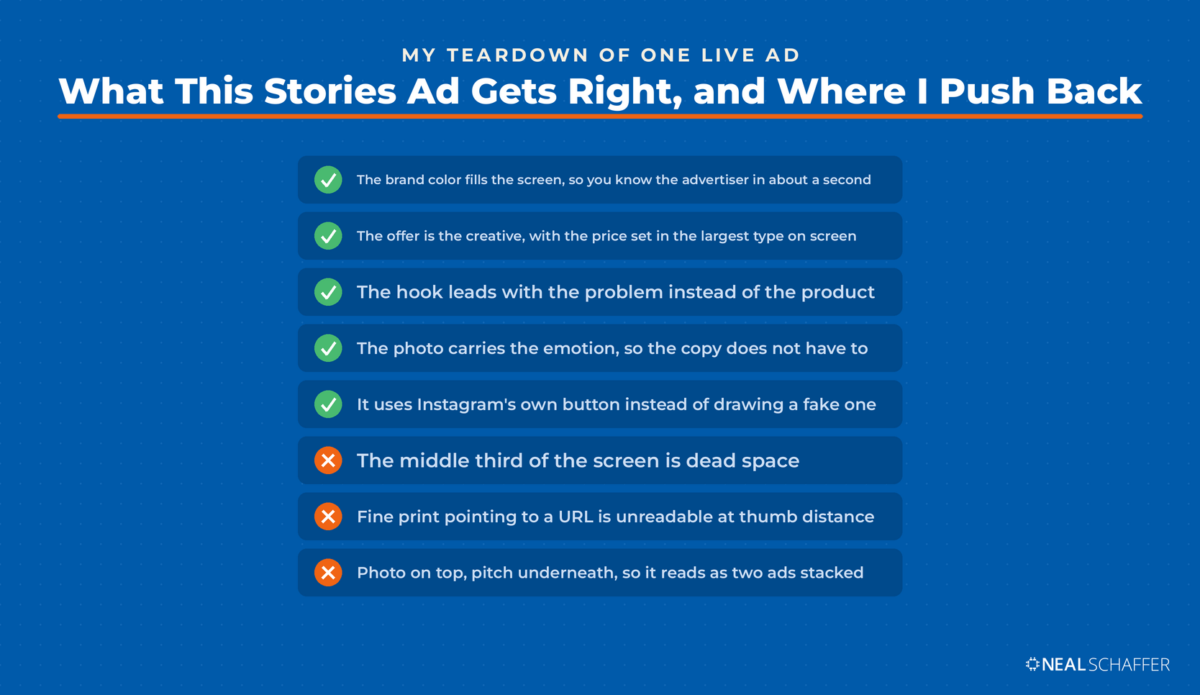
It commits to the brand color instantly. T-Mobile magenta fills the screen. Before I read a word, I knew whose ad it was. In a placement where you get roughly one second before the thumb decides, brand recognition that fast is worth more than a clever line.
The offer is the creative. “$45/mo.” is set in the largest type on the screen, with the qualifier (“w/ Fiber AutoPay, plus taxes/fees”) shrunk beneath it. That hierarchy is correct for Stories. One idea, sized so it reads at a glance on a phone held at arm’s length.
The hook is written for a scroller. “Quit losing to lag” leads with the problem rather than the product, and it takes about a second to process.
The image carries the emotional job. A gamer mid-session, headset on, clearly enjoying herself. The photo says “this is what you get,” so the copy doesn’t have to.
Is LinkedIn Actually Bringing You Business?
My latest book helps professionals, entrepreneurs, and business owners turn LinkedIn from a static profile into a real source of clients and growth.
Maximizing LinkedIn for Business Growth gives you clear, practical steps to build a profile that gets noticed and a network that actually sends business your way.
Grab your copy on Amazon and put it to work this week. Click the cover or the button below to get started.

It uses Instagram’s own button. T-Mobile did not design the white “Learn more” pill at the bottom. Meta renders that call-to-action component on every Stories ad, which is why it looks identical from one advertiser to the next. That’s a good thing. It’s the one element viewers already recognize as tappable, so drawing a fake button into your artwork instead just wastes pixels.
Where I’d push back: the middle third of the screen is dead space. And the fine-print line about checking availability at a URL is unreadable at thumb distance, and pointless when there’s a button right there. I’d also want the person and the offer to feel connected. Right now the photo is on top and the pitch is underneath, like two ads stacked.
Which is the trap most brands fall into. This creative was almost certainly built as a layout and then poured into a 9:16 canvas. Stories rewards creative that was imagined as a moment from the first sketch.
How Crowded Is the Stories Placement, Really?
Stories is the most crowded placement on Instagram by ad volume, not the emptiest. Stories ads took 43% of all Instagram ad impressions in Q4 2025, according to Tinuiti’s benchmark analysis, ahead of Reels at 29% and Feed at an all-time low of 27%. More Instagram ad impressions land in Stories than anywhere else.
| Instagram placement | Share of ad impressions, Q4 2025 |
|---|---|
| Stories | 43% |
| Reels | 29% |
| Feed | 27% |
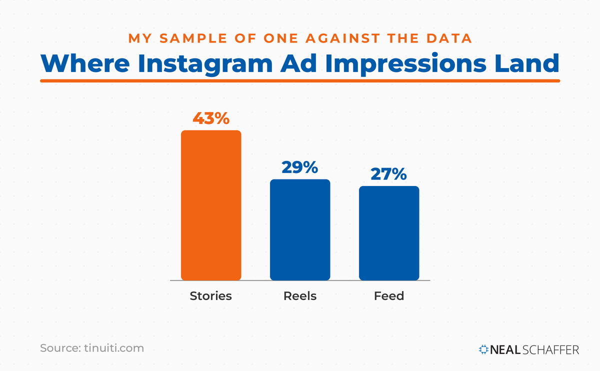
So why did I tap through dozens of Stories to find one ad?
Because ad load in Stories is personal. It depends on how many accounts you follow, how many of them posted today, how long each person’s Story block runs, and what the auction looks like for you specifically. My Saturday night session is a sample size of one, and so is yours. Back in 2021, an eMarketer analyst counted 45 Stories in a sitting and found more than a quarter of them were ads, arriving every four or five organic Stories. Same platform, wildly different experience.
The real opportunity here was never a shortage of advertisers. What’s scarce is competition for the same second. In the feed, your ad shares the screen with the next post, the like button, the comment thread, and whatever the algorithm queued behind it. In Stories, for those few seconds, there is literally nothing else on the glass. Almost nobody designs like that’s true. Whether that full screen also comes cheaper is a separate question, and I compare what Stories ads cost next to Feed and Reels in its own post.
And Instagram is not a small room to be alone in. Meta’s own ad tools showed Instagram ads reaching 1.99 billion users as of April 2026, per DataReportal’s analysis, which ranks Instagram fourth worldwide by reported ad reach. For the wider picture, I keep the Instagram statistics page updated.
What Best Practices Are Specific to Instagram Stories Ads?
Stories ads reward compression, native styling, and a single idea. The format is full-screen, short, sound-optional, and skippable with one tap, so the creative rules diverge sharply from feed ads. Lead with the payoff instead of building to it. Design around the interface overlays. Give the viewer something to do besides tap forward.
Below is how I think about the differences.
| Decision | Feed ad | Stories ad |
|---|---|---|
| Aspect ratio | 1:1 or 4:5 | 9:16, full bleed, no letterboxing |
| Opening | Can build for a beat | Payoff in the first second |
| Copy volume | Caption does real work | Almost none; the screen is the message |
| Sound | Nice to have | Must work silent, and reward sound-on |
| Button | One of several exits | The only exit that counts |
| Success signal | Comments, saves, shares | Taps, replies, sticker interactions |
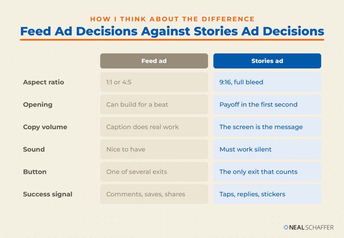
The practices that matter most:
Front-load everything. The viewer’s thumb is already moving. Whatever you want remembered goes in the first frame, not at the end of a 15-second build.
Respect the safe zones. Instagram’s interface sits on top of your creative, with the profile row and progress bars up top and the caption and button down below. Anything you place there gets covered. Keep the important content in the middle band.
Design it vertical from the start. Cropping a square asset into 9:16 is the single most common failure I see. It produces the letterboxed, obviously-recycled look that tells the viewer “ad” before they read anything.
One idea per card. If you need three ideas, use three cards and let them run in sequence. Cramming a product, an offer, a testimonial, and a QR code onto one screen guarantees none of them lands.
Write for sound-off, sweeten for sound-on. Burn in captions. Then add music or a voice that makes the sound-on viewing better rather than necessary.
Use the native button, and point at it. Meta renders the call-to-action pill. Your job is to make the viewer want to tap it, with an arrow, a line of copy, or motion pulling the eye down.
Give them something to do. Stories is the placement where people already reply, vote, and react, and Metricool’s numbers show replies climbing while other signals flatten. A poll or question sticker turns a passive view into an interaction.
Refresh faster than you think. Stories creative fatigues quickly because the same person may cycle past your ad several times in a week. When performance sags, rotate the creative before you touch the targeting.
If you’re producing this yourself, a vertical template makes it survivable. I’m an Adobe Express Brand Ambassador and it’s what I reach for when I need a 1080×1920 asset that doesn’t look like a slide deck escaped. Canva works too. Either way, build the vertical version first and derive the square from it, never the reverse. The same discipline applies to organic formats, which is why an Instagram carousel built for the feed rarely survives a trip into a Story unchanged.
What Kinds of Instagram Stories Ads Examples Are Worth Copying?
The Stories ads worth studying fall into a handful of repeatable shapes, and every one of them is built around a single screen doing a single job. Recognizing the pattern beats collecting brand names, because the pattern is what you can reproduce on Monday morning with whatever budget you have.
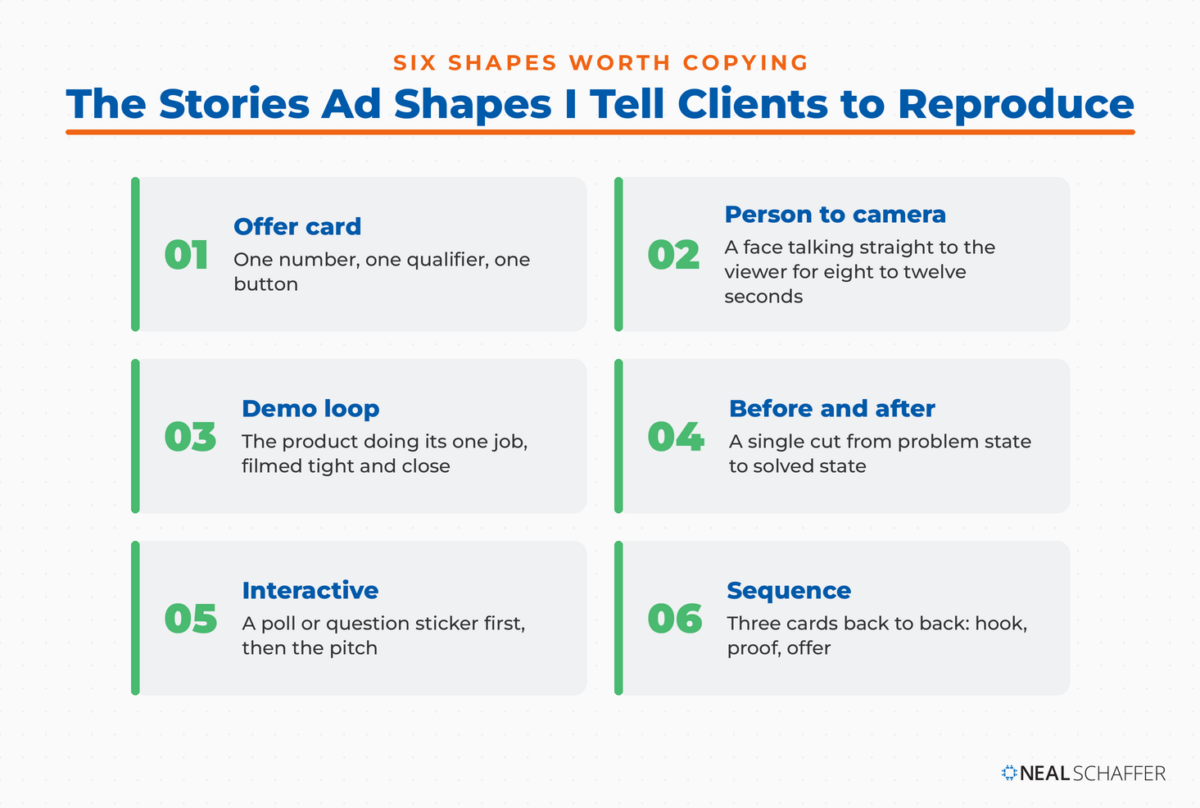
The offer card. One number, one qualifier, one button. The T-Mobile ad above is this shape. It works when the offer itself is the reason to tap, and it fails when the offer is buried under branding.
The person-to-camera. A face, vertical, talking directly to the viewer for eight to twelve seconds. This is the shape that most resembles what the viewer was already watching, which is why it stops the tap. It suits service businesses, coaches, and personal brands.
The demo loop. The product doing the one thing it does, filmed tight and close, no narration required. Strong for physical products where the benefit is visible in two seconds.
The before and after. A single cut, halfway through, from problem state to solved state. It uses the format’s compression as an advantage instead of fighting it.
The interactive. A poll or question sticker with a genuinely interesting question, followed by the pitch. It converts a view into a tap and gives you a signal you can build an audience from later.
The sequence. Three cards that run back to back: hook, proof, offer. This is the only way to tell a longer story in Stories without asking one screen to do too much.
Pick the shape that matches your asset, not the one that looks the most impressive in a case study. A talking-head ad shot on a phone will outperform a beautiful motion-graphics piece if the talking head has something real to say. That’s the same principle I lay out in Digital Threads: the channel rewards content that belongs on it. It’s also why the vertical video habits you build for Instagram Reels transfer directly to Stories ads.
What Do Most Stories Ads Roundups Get Wrong?
Most Stories ad roundups recycle case studies that are five or six years old, from a version of the format that no longer exists. Look for the tell. Any example built around “swipe up” predates link stickers and the current button. The creative advice attached to it is describing a different product than the one running today.
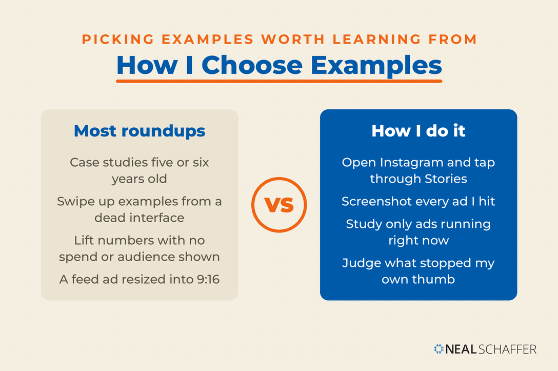
Second, the metrics quoted are almost always lift numbers from campaigns Meta itself published, with no visibility into spend, audience, or what the control looked like. They read well and benchmark badly.
Then there’s the assumption that a good feed ad becomes a good Stories ad with a resize. It doesn’t. The placement, the mindset, the available seconds, and the physical gesture are all different.
My advice is unglamorous: open Instagram, tap through Stories for ten minutes, and screenshot every ad you hit. You’ll learn more about what stops your own thumb than any roundup will teach you, and you’ll be studying ads that are running right now instead of in 2019. That’s exactly how the example in this post was chosen.
While you’re in there, look at what the algorithm is serving you and why, because the Instagram algorithm shapes the organic Stories your ad is sandwiched between. And if you want to test the water first, understanding what happens when you boost an Instagram post is a reasonable place to start. It won’t substitute for a properly structured Stories campaign. The wider case for advertising on Instagram is worth reading before you set a budget.
Frequently Asked Questions
Short. A static Stories ad card gets about five seconds and video is capped at 15 per card. Most of the work happens in the first one to two seconds, so treat anything past second eight as a bonus rather than the plan.
It depends on the objective, and you should test rather than assume. Stories tends to suit awareness, offers, and interaction-driven campaigns, while feed suits considered purchases where people want to read, revisit, and check comments. Running both and comparing on your own account is the only reliable answer.
Yes, and you should. Poll and question stickers are among the few tools that convert a passive full-screen view into a measurable interaction, and Stories replies have been climbing while other engagement signals flatten.
A static image works, and for offer-led ads it often works better because it holds the message still. Video wins when the product needs to be seen doing something, or when a human face is doing the selling. Bad video loses to good static every time.
Sooner than feed creative. The same viewer can pass your ad multiple times in a week, so watch for rising frequency and falling tap-through, and rotate the creative before you start rebuilding targeting.
Start Testing Stories Ads This Week
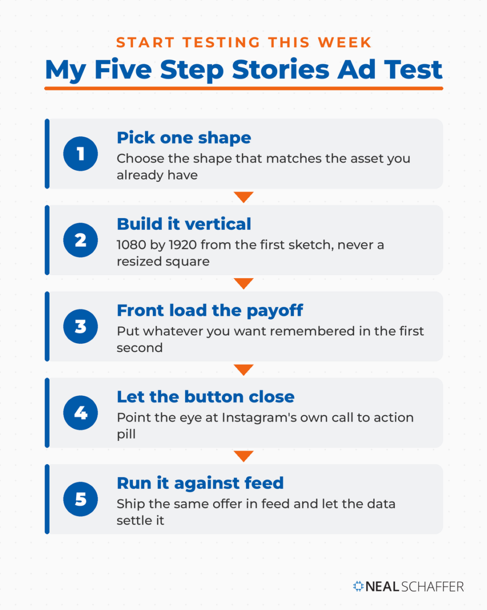
Pick one shape from the list above, build it vertically at 1080×1920, put the payoff in the first second, and let Instagram’s own button do the closing. Then run it against a feed version of the same offer and let the data settle the argument.
Your paid Stories have to sit beside your organic ones, so start with Instagram Story ideas. Instagram Highlights will then give your best Stories a second life. If you’d rather have someone build the paid and organic sides together, take a look at my Fractional CMO services. You can also download a free preview of Digital Threads to see how I sequence paid social against everything else. And if you’d like to work through this alongside other business owners, that’s what the Digital First Mastermind is for.