Editorial Note: I may earn a commission when you visit links that appear on my website.
Twitter (X) Analytics for Marketers: The Complete Guide to Metrics, KPIs & Reporting [2026]
X (formerly Twitter) is more than just a conversation platform. It can be a powerful engine for brand building, community engagement, and driving measurable business results.
Think about it: X has over 600 million monthly active users who are actively sharing opinions, discovering brands, and making purchasing decisions in real-time. If you’re serious about making your mark in marketing, understanding X analytics isn’t just a suggestion—it’s your secret weapon.
Having helped countless businesses develop their social media strategies, I can tell you that the marketers who thrive are those who speak the language of data. This guide is your personal mentor for navigating the data jungle and emerging with actionable insights.
Key Takeaways
✅ X analytics requires Premium subscription ($8-$22/month) for full dashboard access—free users only see basic per-post stats
✅ Average X engagement rate is 0.015-0.5% in 2025; aim for 1%+ to be considered strong performance
✅ Native analytics retains 28 days easily accessible, up to 90 days exportable—third-party tools needed for longer history
✅ Track metrics that tie to business outcomes: website clicks, conversions, and brand sentiment—not just vanity numbers
✅ Cross-platform metric standardization and Twitter SEO are advanced strategies most marketers miss
Why X Analytics Is Non-Negotiable for Modern Marketers
X analytics transforms abstract social media activity into concrete evidence of business value. Without data, you’re just spending money and hoping for the best—a dangerous game no successful marketer plays. The platform’s hundreds of millions of users represent a massive opportunity, but only if you can measure what’s working.
The Evolution of X for Business
Remember the early days of Twitter? It was a wild west of 140-character thoughts. Fast forward to X, and it’s a sophisticated ecosystem where brands launch products, engage in real-time customer service, and shape public opinion.
The shift to paid analytics access represents one of the most significant platform changes. Full analytics access is now primarily available through X Premium subscriptions, marking a clear signal that the platform views data as a premium asset.
Why data-driven strategy is no longer optional:
- Algorithm complexity: X’s algorithm constantly evolves, making intuition-based posting unreliable
- Increased competition: With millions of brands vying for attention, data helps you cut through the noise
- Stakeholder expectations: According to Sprout Social, 93% of consumers want brands to keep up with online culture—analytics show you how
What’s at Stake: Proving ROI in a Skeptical Landscape
Let’s be honest: proving the return on investment for social media efforts can feel like a perpetual uphill battle. Stakeholders often view social media as a “nice-to-have” rather than a “must-have” revenue driver. I’ve written extensively about calculating social media ROI, and the challenge is real.
Connecting social metrics to business outcomes requires more than vanity metrics. You need to track:
- Website traffic from X
- Lead generation and conversions
- Brand sentiment shifts
- Customer acquisition costs
The cost of “vanity metric” reporting is significant. Reporting on impressions alone without context leads to:
- Budget cuts based on incomplete data
- Misallocated resources toward low-performing content
- Missed opportunities to optimize what’s actually working
How to Access the X Analytics Dashboard
Before you can unlock the power of data, you need to know how to get to your command center. Accessing X analytics is straightforward, but there are crucial nuances depending on your account type and device.
Desktop Access (X Premium Required)
X analytics requires an X Premium subscription for full dashboard functionality. Here’s the current pricing:
| Tier | Monthly Price | Annual Price | Analytics Access |
|---|---|---|---|
| Basic | $3 | $32/year | ❌ No |
| Premium | $8 | $84/year | Limited |
| Premium+ | $22 | $168/year | ✅ Full Access |
Step-by-step walkthrough:
- Log in to your X account on a desktop browser
- Click “More” in the left-hand navigation menu
- Select “Creator Studio,” then “Analytics”
- Alternatively, navigate directly to analytics.twitter.com
- If prompted, confirm your Premium subscription access
For enterprise and business accounts, X offers Verified Organizations starting at $200/month for basic access and $1,000/month for full features.
Mobile Access (Limited Stats)
While X offers an intuitive mobile app, its analytics capabilities are more limited compared to desktop. You can see basic performance metrics for individual posts, but a comprehensive dashboard view isn’t available.
What free users can see:
- Open the X app on your mobile device
- Navigate to a specific tweet you’ve posted
- Tap the small bar graph icon below the tweet
- View “Tweet Activity” showing impressions, engagements, profile clicks, and link clicks for that specific tweet
This is helpful for quick checks, but don’t rely on it for strategic decision-making.
Key Limitations to Know Before You Start
Setting realistic expectations is crucial. X analytics, while powerful, has inherent limitations:
Data retention limits:
According to Tweet Archivist, X’s native analytics provides:
Is LinkedIn Actually Bringing You Business?
My latest book helps professionals, entrepreneurs, and business owners turn LinkedIn from a static profile into a real source of clients and growth.
Maximizing LinkedIn for Business Growth gives you clear, practical steps to build a profile that gets noticed and a network that actually sends business your way.
Grab your copy on Amazon and put it to work this week. Click the cover or the button below to get started.

- 28 days easily accessible in the web interface
- Up to 90 days exportable via CSV
- Unlimited historical data requires third-party tools
Organic vs. paid data separation issues:
- Native analytics blend organic and promoted tweet performance
- Separating the two requires manual filtering or third-party tools
- This makes true organic performance assessment challenging
API Changes:
The X API has undergone significant changes, impacting how third-party tools access data. This can result in gaps in historical data from connected platforms.
Understanding these limitations upfront helps you interpret your data wisely and identify where additional social media analytics tools might be needed.
Understanding the X Analytics Dashboard: Your Command Center
Think of the X analytics dashboard as the cockpit of your marketing spacecraft. Each dial and screen provides critical information for monitoring performance, identifying trends, and making informed decisions.
What’s in the Overview Tab?
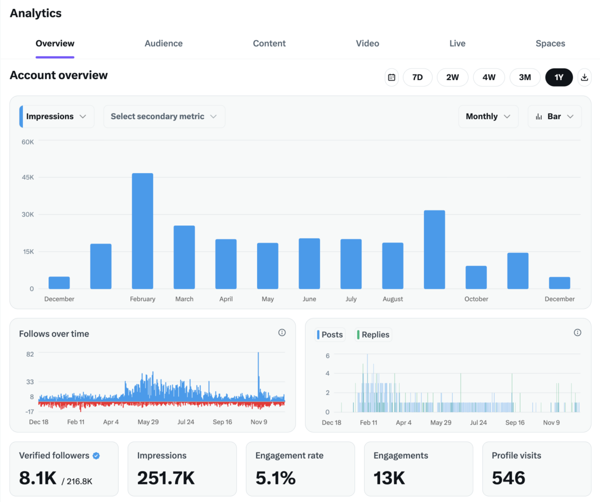
The Overview tab is your executive summary—a visual snapshot of your account’s performance across customizable time periods. You can toggle between 7 days, 2 weeks, 4 weeks, 3 months, or a full year using the date range buttons in the top right corner.
The main performance chart dominates the top of the screen, displaying your primary metric (Impressions by default) as a bar graph over time. You can customize this view by:
- Selecting a different primary metric from the dropdown
- Adding a secondary metric for comparison
- Switching between Monthly, Weekly, or Daily views
- Toggling between Bar and Line chart formats
- Exporting your data using the download icon
Below the main chart, you’ll find two trend graphs:
| Chart | What It Shows | Why It Matters |
|---|---|---|
| Follows over time | Daily follower gains (blue) and losses (red) | Identifies what content drives follows—and unfollows |
| Posts & Replies | Your posting activity by day | Correlates your output with performance results |
The bottom metrics bar provides your key performance indicators at a glance:
| Metric | What It Measures |
|---|---|
| Verified followers | How many of your followers have verification badges (shown as a ratio of verified/total) |
| Impressions | Total number of times your posts were viewed |
| Engagement rate | Percentage of impressions that resulted in engagements |
| Engagements | Total interactions (likes, reposts, replies, clicks) |
| Profile visits | How many users clicked through to view your profile |
Pro tip: The Follows over time chart is particularly valuable. When you see a spike in new followers (blue), cross-reference it with your Content tab to identify which posts drove that growth. Similarly, a cluster of unfollows (red) might signal content that didn’t resonate with your audience.
Notice the navigation tabs at the top: Overview, Audience, Content, Video, Live, and Spaces. Each provides deeper insights into specific aspects of your X performance—we’ll cover the most important ones in the sections that follow.
Audience Insights: Who Are You Really Talking To?
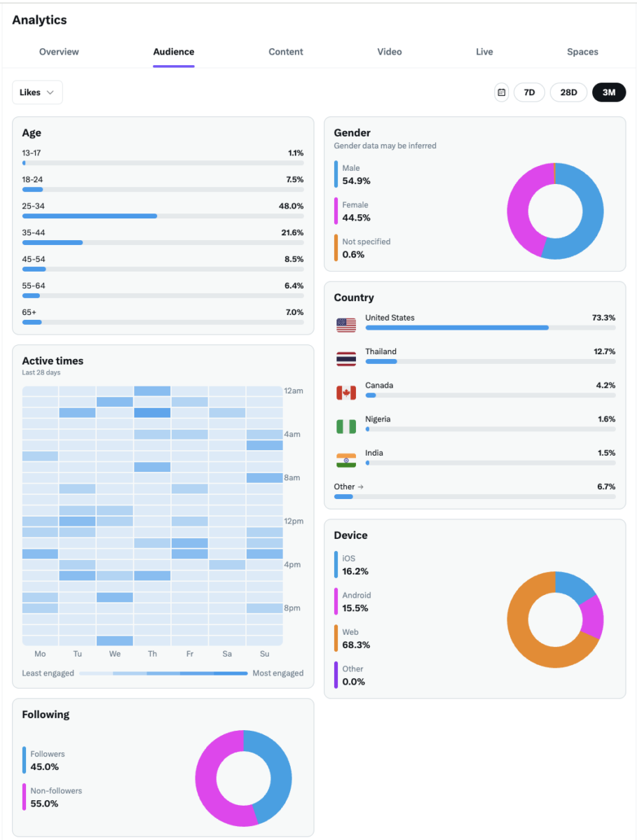
The Audience tab is a goldmine for refining your targeting and content strategy. It moves beyond just what happened to who is engaging with your content. You can filter this data by engagement type (Likes, Reposts, Replies, etc.) and time period (7 days, 28 days, or 3 months).
Demographics at a glance:
| Data Point | What It Shows | Strategic Value |
|---|---|---|
| Age | Percentage breakdown across age brackets (13-17, 18-24, 25-34, 35-44, 45-54, 55-64, 65+) | Align content tone and references to your primary age group |
| Gender | Male, Female, and Not Specified percentages (note: gender data may be inferred) | Tailor messaging and visual content accordingly |
| Country | Geographic distribution with country flags and percentages | Optimize posting times and localize content |
| Device | iOS, Android, Web, and Other usage breakdown | Ensure content displays well on primary devices |
The Active Times heatmap is one of the most actionable features in X Analytics. This grid shows you exactly when your audience is most engaged, broken down by:
- Day of the week (Monday through Sunday on the horizontal axis)
- Time of day (12am through 8pm+ on the vertical axis)
- Engagement intensity (darker blue = most engaged, lighter = least engaged)
Use this heatmap to schedule your most important posts during peak engagement windows. If you see dark blue clusters on Wednesday afternoons and Thursday mornings, that’s when your audience is most active—don’t waste your best content on Sunday at 3am.
The Following breakdown reveals something crucial: what percentage of your engagement comes from followers versus non-followers. This donut chart shows you:
- Followers: People who already follow you engaging with your content
- Non-followers: New audiences discovering you through the algorithm, search, or shares
A healthy split here is valuable data. High non-follower engagement suggests your content is reaching new audiences effectively. If you’re only reaching existing followers, you may need to adjust your hashtag strategy, post timing, or content type to expand your reach.
Pro tip: If your data shows that 48% of your engaged audience is in the 25-34 age bracket (like in the example above), but your content is written for executives in their 50s, you have a targeting mismatch. Either adjust your content to match who’s actually engaging, or refine your strategy to attract your intended audience. This tab gives you the reality check you need.
Device data matters more than you think. If 68% of your audience engages via Web (desktop), you have more flexibility with link-heavy content and longer threads. If mobile dominates, prioritize visual content and ensure any linked pages are mobile-optimized.
Demystifying the Content Tab
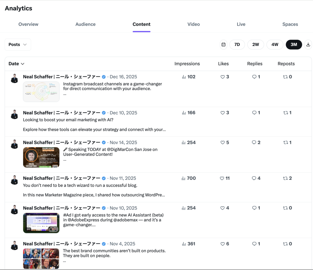
The Content tab is where you roll up your sleeves and dive into the nitty-gritty of your post performance. This section displays all your posts within a selected timeframe (7 days, 2 weeks, 4 weeks, or 3 months), with detailed metrics for each.
You can filter by content type using the dropdown menu (Posts, Replies, etc.) to analyze different aspects of your activity separately.
Each post displays four key metrics in a sortable table:
| Metric | What It Measures | What to Look For |
|---|---|---|
| Impressions | How many times your post was viewed | Higher impressions = greater visibility in feeds |
| Likes | Number of users who liked your post | Quick indicator of content resonance |
| Replies | Direct responses to your post | Shows conversation-starting potential |
| Reposts | How many times users shared your post | Strongest signal of share-worthy content |
Click on the Date column header to sort your posts chronologically (newest or oldest first), or mentally scan the metrics columns to identify your top performers.
What this view reveals at a glance:
Looking at the example above, you can immediately see that the November 11th post about outsourcing WordPress (700 impressions, 11 likes, 4 replies, 2 reposts) dramatically outperformed other content. That’s your signal to dig deeper: Was it the topic? The hook? The timing? The fact that it referenced a published article in Marketer Magazine?
Meanwhile, posts with images (like the DigiMarCon speaking announcement) and posts with strong opinion hooks (“The best brand communities aren’t built on products. They are built on people.”) also performed well.
Pro tip: Export your data using the download icon in the top right corner to analyze trends in a spreadsheet. Look for patterns:
- Do posts with images consistently outperform text-only posts?
- Do certain topics drive more replies while others drive more reposts?
- What day of the week produces your best-performing content?
The Content tab is your laboratory for content experimentation. Use it to identify what’s working, double down on successful formats, and stop wasting effort on content types that consistently underperform.
Note: Unlike some third-party tools, the native Content tab doesn’t show you engagement rate per post or link clicks directly in this view. You’ll need to click into individual posts or calculate engagement rate manually (Total Engagements ÷ Impressions × 100) if you want that level of detail.
Video Analytics: Measuring Visual Content Performance
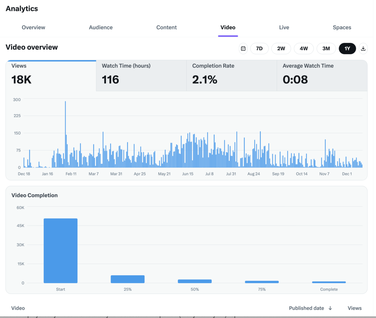
If you’re investing in video content on X, the Video tab provides dedicated analytics that go far beyond what you’ll see in the Content tab. This is where you understand not just if people watched, but how they watched.
The top metrics bar shows four key performance indicators:
| Metric | What It Measures | Why It Matters |
|---|---|---|
| Views | Total number of video views across all your content | Overall reach of your video strategy |
| Watch Time (hours) | Cumulative hours users spent watching your videos | Indicates depth of engagement, not just clicks |
| Completion Rate | Percentage of viewers who watched to the end | The ultimate test of whether your content holds attention |
| Average Watch Time | Mean duration viewers spent on your videos | Helps identify ideal video length for your audience |
The Views trend chart displays daily video views over your selected time period (7 days to 1 year). Spikes in this chart help you identify which videos drove significant traffic—cross-reference with your posting history to understand what worked.
The Video Completion funnel is arguably the most valuable visualization in this tab. This bar chart shows viewer drop-off at key milestones:
- Start: Everyone who began watching
- 25%: Viewers who made it through the first quarter
- 50%: Viewers who watched at least half
- 75%: Viewers approaching completion
- Complete: Viewers who watched the entire video
How to read this data: In the example above, around 50,000 people started watching, but only about 2,000 completed the videos (reflected in the 2.1% completion rate). That dramatic drop-off is normal for social video—but it’s also your optimization opportunity.
What the completion funnel tells you:
| Drop-off Point | Likely Cause | Fix |
|---|---|---|
| Massive drop at Start → 25% | Weak hook, misleading thumbnail, or wrong audience | Strengthen your first 3 seconds; make the hook unmissable |
| Steady decline 25% → 50% | Content drags or loses focus | Tighten your pacing; cut the fluff |
| Drop at 50% → 75% | Video is too long for the value delivered | Consider shorter formats or break into parts |
| Strong retention to Complete | Content delivers on its promise | Double down on this format |
Below the charts, you’ll find a list of individual videos sortable by Published Date and Views, allowing you to identify your top performers.
Pro tip: An 8-second average watch time (like in the example) tells you that viewers are making very quick judgments about your content. If your videos are 60 seconds long but average watch time is 8 seconds, you’re losing people almost immediately. Test different hooks, start with your most compelling point, and consider whether shorter-form video (under 15 seconds) might perform better for your audience.
What About the Live and Spaces Tabs?
You’ll notice two additional tabs in your analytics dashboard: Live and Spaces. These provide performance data for X’s live video streaming feature and audio conversation rooms, respectively.
- Live tracks metrics for any live video broadcasts you’ve hosted, including viewer counts, watch time, and engagement during the stream
- Spaces shows analytics for audio rooms you’ve hosted, including listener counts and participation metrics
If you’re not actively using these features, these tabs will appear empty. For most marketers focused on standard posts and pre-recorded video, the Overview, Audience, Content, and Video tabs covered above will be your primary analytics focus. However, if live content is part of your strategy, these tabs provide the same level of insight you’d expect from the Video tab.
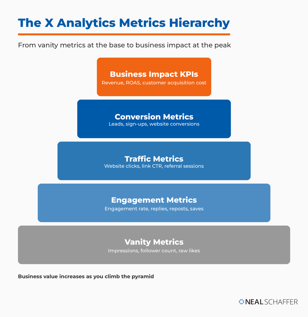
Key X Metrics Every Marketer Should Track
Metrics are the individual data points you collect. While there are many, a few are absolutely crucial for understanding your X marketing effectiveness. These are the fundamental building blocks of your analysis.
Reach & Impressions: Casting a Wider Net
Impressions represent the number of times your tweet was seen by users. If one person scrolls past your tweet five times, that’s five impressions. It’s a measure of visibility—think of it as how many people could have seen your billboard on the highway.
Reach refers to the number of unique users who saw your tweet. While X’s native analytics don’t show reach directly, understanding the distinction matters:
| Metric | Definition | What High Numbers Mean |
|---|---|---|
| Impressions | Total views (including repeat views) | Content is being served frequently |
| Reach | Unique users who saw content | Content is spreading to new audiences |
High impressions with low reach indicates your content is only seen by a small, engaged group. High reach with moderate impressions means your content is spreading widely but perhaps not intensely.
Engagement Rate: The True Measure of Connection
Engagement rate—arguably the most important metric—tells you how many people who saw your post actually interacted with it.
The Formula:
Engagement Rate = (Total Engagements / Total Impressions) × 1002025 Benchmarks based on research from Rival IQ and Hootsuite:
| Performance Level | Engagement Rate |
|---|---|
| Poor | Below 0.02% |
| Average | 0.02% – 0.09% |
| Good | 0.1% – 0.5% |
| Strong | 0.5% – 1.0% |
| Excellent | 1%+ |
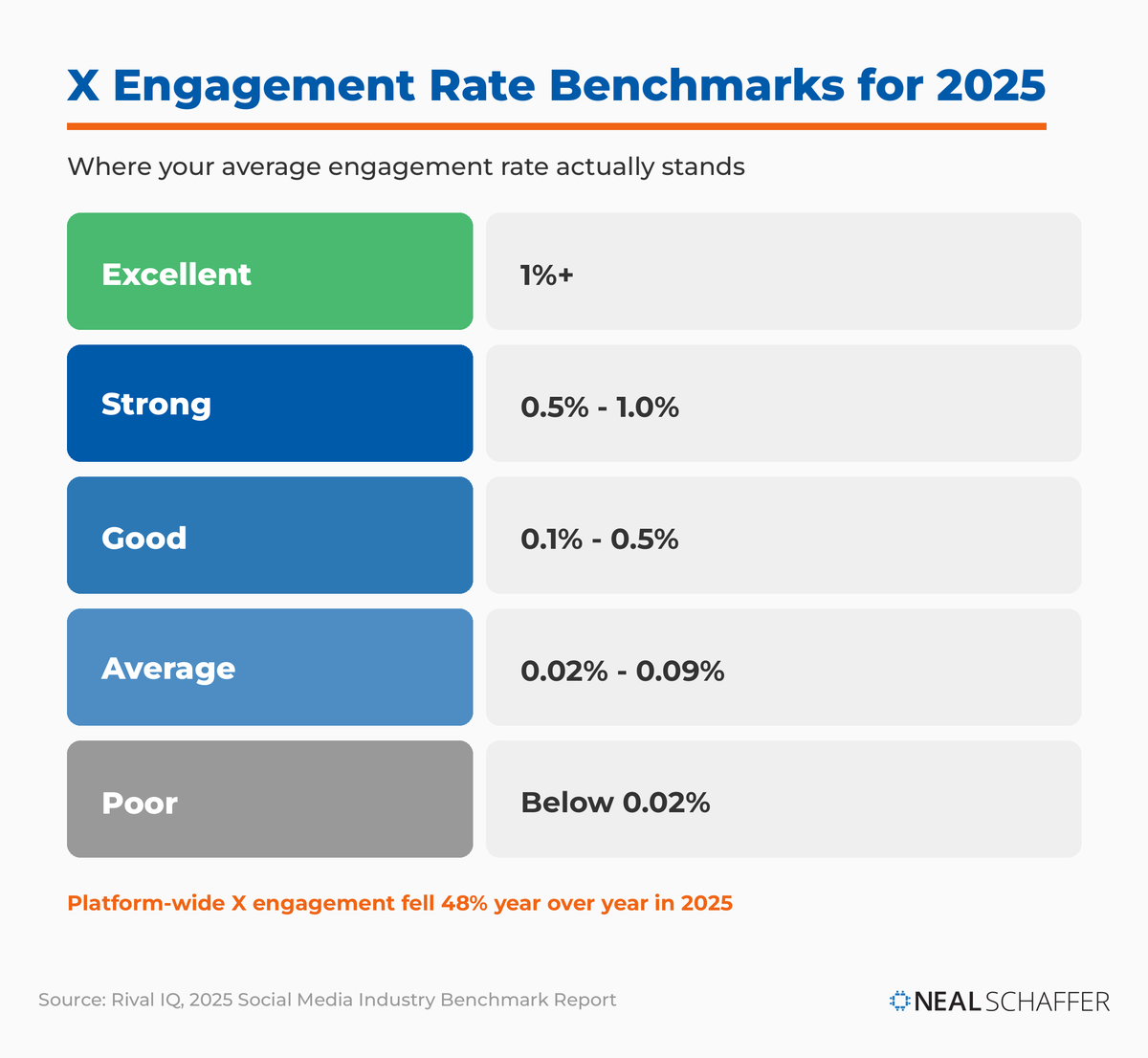
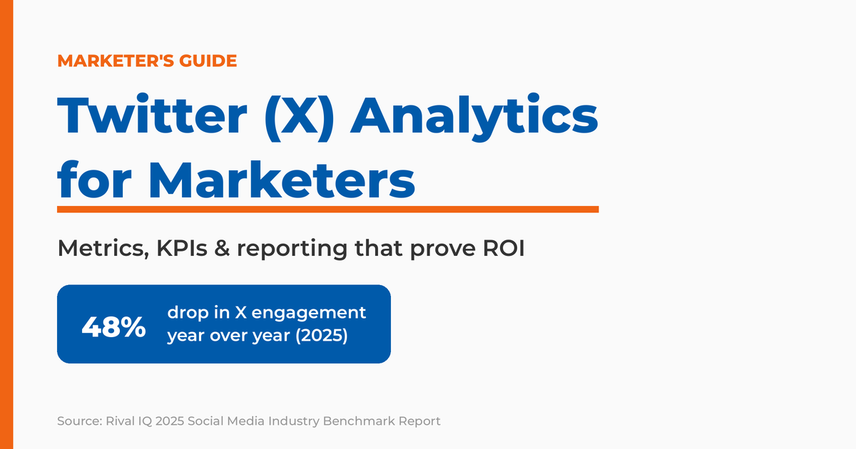
According to the Rival IQ Social Media Industry Benchmark Report, X engagement rates dropped 48% year-over-year, falling from 0.029% in 2024 to just 0.015% in 2025. This makes achieving strong engagement even more impressive—and necessary.
A high engagement rate signifies that your content is compelling, relevant, and sparks a reaction. It’s not enough for people to see your message; you want them to care enough to do something about it.
Follower Growth: Building Your Tribe
This metric tracks the increase or decrease in your follower count over time. While not a direct indicator of ROI, a healthy, consistent follower growth indicates that your content is attracting new audiences and your brand message is resonating.
Key considerations for follower quality/bot detection:
- Sudden, unexplained spikes often indicate bot activity
- Check follower-to-engagement ratio (healthy accounts have 1-3% engagement)
- Use Twitter audit tools to identify fake followers
- Prioritize organic, quality followers over sheer quantity
- Monitor unfollows as closely as follows—high churn indicates content mismatch
Website Clicks: Driving Action
For many businesses, the ultimate goal of X marketing is to drive traffic to their website. This metric directly tracks how many times users clicked a link in your tweet.
Link CTR (Click-Through Rate) Benchmarks:
| Performance | CTR Range |
|---|---|
| Below Average | Under 0.5% |
| Average | 0.5% – 1.5% |
| Good | 1.5% – 2.0% |
| Excellent | 2%+ |
A high number of website clicks, especially when paired with a good engagement rate, indicates that your X content is effectively funneling users to your owned digital properties, where deeper conversions can occur.
Mentions & Replies: Understanding the Conversation
Mentions occur when other users tag your handle (@yourbrand) in their tweets. This is a powerful indicator of brand awareness and reveals organic conversations happening around your brand.
Replies are direct responses to your tweets—a clear sign of active engagement that often leads to valuable customer insights, feedback, or support interactions.
Monitoring mentions and replies helps you gauge brand sentiment and participate directly in the community. Use Twitter hashtag search techniques to track broader conversations.
Video Views & Completions: Visual Storytelling Impact
If you’re investing in video content on X, these metrics are vital.
Video completion rate benchmarks by video length:
| Video Length | Good Completion Rate | Excellent Completion Rate |
|---|---|---|
| Under 15 seconds | 60%+ | 75%+ |
| 15-30 seconds | 45%+ | 60%+ |
| 30-60 seconds | 30%+ | 45%+ |
| Over 60 seconds | 20%+ | 35%+ |
A high completion rate means your video content is captivating and holds your audience’s attention—a rare feat in a scroll-happy world.
Essential X KPIs for Marketing Success
While metrics are the raw data, Key Performance Indicators (KPIs) are the metrics you deem most important for measuring progress towards your specific marketing goals. They’re the benchmarks against which you judge success or failure.
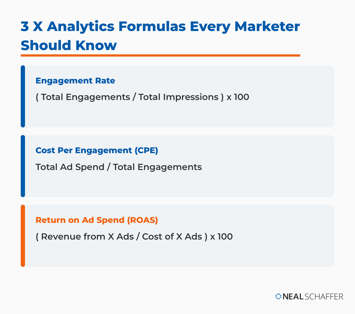
Cost Per Engagement (CPE)
This KPI is particularly relevant for paid X campaigns. CPE measures how much you pay for each interaction on your promoted tweets.
Formula:
CPE = Total Ad Spend / Total EngagementsBenchmarks by industry:
| Industry | Average CPE | Good CPE |
|---|---|---|
| E-commerce | $0.50-$2.00 | Under $0.40 |
| B2B/Tech | $2.00-$5.00 | Under $1.50 |
| Consumer Goods | $0.30-$1.50 | Under $0.25 |
A lower CPE means your ad spend is more efficient, indicating that your ad copy, targeting, and creative are performing well and resonating with your audience without breaking the bank.
Return on Ad Spend (ROAS)
For performance marketers, ROAS is king. It calculates the revenue generated for every dollar spent on X advertising.
Formula:
ROAS = (Revenue from X Ads / Cost of X Ads) × 100A ROAS of 300% means you’re getting $3 back for every $1 spent. This KPI directly ties your X ad efforts to your bottom line, making it incredibly powerful for proving ROI to stakeholders.
Lead Generation & Conversions from X
This KPI measures how many leads (newsletter sign-ups, ebook downloads, webinar registrations) are directly generated from your X activities.
Conversion Potential Formula:
Conversion Potential = (Website Clicks × Landing Page Conversion Rate) × Lead ValueThis requires proper tracking through:
- UTM parameters on all X links
- Conversion tracking pixels on your website
- Integration with your CRM system
For B2B marketers, this is often a primary KPI, demonstrating X’s role in filling the sales funnel.
Brand Sentiment: Beyond the Numbers
While X’s native analytics don’t offer a direct “sentiment score,” this is a critical KPI that marketers must track using third-party social listening tools.
Brand Impact Score Formula:
Brand Impact Score = (Positive Mentions - Negative Mentions) / Total Mentions × 100Brand sentiment measures the overall emotional tone of conversations about your brand on X—is it positive, negative, or neutral? A shift in sentiment can be a leading indicator of:
- Brand perception changes
- PR issues brewing
- Successful campaign impact
Imagine a sudden spike in mentions, but they’re all negative—that’s a very different story than a spike in positive mentions.
Crafting Actionable X Analytics Reports
Collecting data is only half the battle. The real victory comes in transforming it into compelling reports that drive strategic decisions—telling a story, not just listing numbers.
Defining Your Reporting Goals
Before you even open a spreadsheet, ask yourself: What is the purpose of this report?
Common reporting objectives:
- Showcase monthly growth to leadership
- Justify a budget increase for new campaigns
- Identify underperforming content types
- Prove the ROI of a specific campaign
- Guide content strategy adjustments
Your goal dictates which metrics and KPIs you emphasize, the level of detail, and the overall narrative. Don’t just report everything; report what matters to your objective.
Structuring Your Report: A Practical Framework
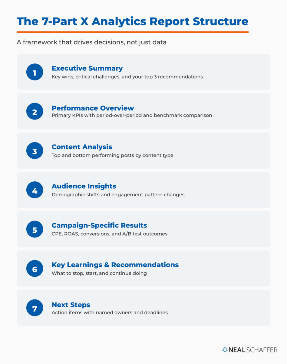
A solid report structure ensures clarity and impact:
- Executive Summary (60 seconds version)
- Key wins
- Critical challenges
- Top 3 recommendations
- Performance Overview
- Primary KPIs with period-over-period comparison
- Benchmark comparisons
- Traffic and conversion data
- Content Analysis
- Top 5 performing posts (with screenshots)
- Bottom 5 performing posts
- Content type performance breakdown
- Audience Insights
- Demographic shifts
- Engagement pattern changes
- Follower quality metrics
- Campaign-Specific Results (if applicable)
- CPE, ROAS, conversions
- A/B test results
- Budget efficiency analysis
- Key Learnings & Recommendations
- What to stop doing
- What to start doing
- What to continue doing
- Next Steps
- Specific action items with owners and deadlines
Visualizing Data for Impact
Raw numbers can be daunting. Visuals make data digestible and memorable.
| Chart Type | Best Used For | Example Application |
|---|---|---|
| Line Graph | Trends over time | Follower growth, impression changes |
| Bar Chart | Comparing categories | Content type performance, campaign comparison |
| Pie Chart | Showing proportions | Engagement type breakdown |
| Heat Map | Time-based patterns | Optimal posting times |
Use clear labels, appropriate scales, and avoid clutter. A picture truly is worth a thousand data points when it comes to reporting.
Translating Data into Strategic Adjustments
This is the bridge between analysis and action. For every insight, ask: So what? and Now what?
Example translations:
| Insight | Strategic Adjustment |
|---|---|
| Polls have 3x higher engagement rate | Increase interactive polls by 20% next month |
| Website clicks low despite high impressions | Refine CTAs to be more explicit and compelling |
| Video completion drops after 15 seconds | Create shorter, punchier video content |
| Engagement peaks at 9 AM weekdays | Shift posting schedule to morning hours |
Your report should conclude not with a summary of past events, but with a clear roadmap for future success.
Advanced X Analytics Strategies for Deeper Insights
Ready to move beyond the basics? Advanced analytics strategies allow you to extract even richer insights and truly optimize your X marketing.
Competitive Analysis on X
Don’t just look inward—what are your competitors doing on X?
What to monitor:
- Content types getting the most engagement
- Hashtag strategies they’re using
- Follower growth rates compared to yours
- Response times and customer service approach
- Gaps in their content you can fill
Set up social listening for competitor brand names, product names, and relevant keywords to see what people are saying about them. This helps you identify gaps, capitalize on opportunities, and learn from their successes and failures.
Audience Segmentation & Persona Refinement
The Audience tab gives you a good start, but you can go deeper. Combine X data with insights from other platforms (website analytics, CRM) to create more detailed audience segments.
Practical segmentation approach:
- Export audience demographics from X analytics
- Cross-reference with Google Analytics referral data
- Identify behavior patterns by segment
- Create targeted content for each segment
For example, you might discover that a segment of your X audience interested in “Tech News” also frequently visits your blog’s developer resources section. This allows you to craft highly targeted content specifically for this segment.
Use real X data to add depth and nuance to your existing buyer personas, ensuring they accurately reflect the online behavior and interests of your target customers.
A/B Testing Content and Ad Creative
The scientific method applies to X marketing. Don’t guess what works—test it.
Organic content testing variables:
- Tweet structure (question vs. statement)
- Visual types (image vs. GIF vs. video)
- CTA placement and wording
- Hashtag quantity and selection
- Posting times
Paid ad testing:
X’s ad platform provides robust tools for running A/B tests. Test:
- Ad copy variations
- Headlines
- Visual creative
- Audience targeting parameters
- Bidding strategies
Integrating X Data with Other Marketing Channels
X doesn’t live in a vacuum. Its data becomes exponentially more powerful when integrated.
Cross-platform metric standardization:
One of the biggest challenges marketers face is comparing performance across platforms. According to New Digital Age, the lack of unified measurement makes cross-platform analysis challenging in 2024-2025.
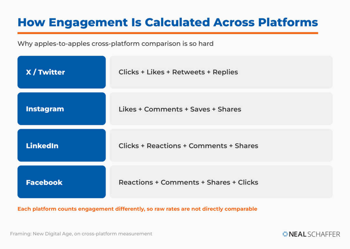
| Platform | Engagement Calculation | Impressions Definition | Reach Calculation |
|---|---|---|---|
| X/Twitter | Clicks + Likes + Retweets + Replies | Total views including repeat | Not natively available |
| Likes + Comments + Saves + Shares | Total views | Unique accounts reached | |
| Clicks + Reactions + Comments + Shares | Total views | Unique members who saw | |
| Reactions + Comments + Shares + Clicks | Total times content displayed | Unique people who saw |
Integration strategies:
- CRM Integration: Connect X leads to build a holistic view of customer journeys
- Website Analytics: Use UTM parameters on all X links to track referral traffic, bounce rate, and conversions
- Email Marketing: Use X to grow your email list, and use email to drive X engagement
- Attribution Modeling: Implement multi-touch attribution to understand X’s role in the conversion path
Twitter SEO: Optimizing for Search on X
Yes, X has its own search engine. People use X’s search function to find trending topics, news, and brands. According to SEO Sherpa, X SEO is becoming increasingly important for brand visibility.
Key optimization strategies:
- Profile Optimization
- Include relevant keywords in your bio
- Use a clear, recognizable profile photo
- Pin your best-performing or most strategic tweet
- Content Optimization
- Incorporate keywords naturally into tweets
- Use 1-2 strategic hashtags (not hashtag stuffing)
- Post during peak engagement times (8 AM – 2 PM weekdays)
- Engagement Signals
- Respond quickly to replies (keeps tweets active in feeds)
- Encourage conversations through questions
- High engagement signals relevance to X’s algorithm
- Recency Matters
- X’s algorithm heavily weights recent content
- Consistent posting maintains visibility
- Timely content around trending topics performs better
For more Twitter-specific optimization tactics, check out my guide to Twitter tools.
Tools to Supercharge Your X Analytics
While X’s native analytics are a great starting point, third-party tools unlock deeper insights, streamline workflows, and integrate data from multiple sources.
Third-Party Analytics Platforms
Here’s how some of the major platforms compare:
| Tool | Starting Price | Best For | Key X Features |
|---|---|---|---|
| Hootsuite | $99/month | Teams needing workflow management | Unified reporting, OwlyWriter AI, social listening |
| Sprout Social | $249/user/month | Enterprise teams needing deep analytics | AI recommendations, CRM integration, competitive benchmarking |
| Buffer | Free – $120/month | Small businesses and beginners | Clean interface, core analytics, strategic recommendations |
| Fedica | $10/month | Audience analysis specialists | City-level geographic data, follower insights, historical analysis |
Sprout Social excels at comprehensive reporting and competitive analysis. According to G2 ratings, customers rate Sprout an 8.0 for social media analytics compared to Hootsuite’s 7.8.
Hootsuite offers the best value for teams that need strong workflow features and third-party integrations. Their OwlyWriter AI helps optimize content for engagement.
Buffer provides an excellent entry point with their free plan, though analytics depth is limited compared to enterprise tools.
Fedica (formerly Tweepsmap) stands out for geographic and demographic audience insights, mapping followers down to the city level.
Social Listening Tools
Dedicated social listening tools monitor conversations across X in real-time, providing invaluable insights into brand perception, industry trends, and competitor activities.
Key capabilities to look for:
- Brand mention tracking (even without direct tags)
- Keyword and hashtag monitoring
- Sentiment analysis (positive, negative, neutral)
- Influencer identification
- Emerging trend detection
- Competitor conversation monitoring
Popular options include Brandwatch, Talkwalker, and Mention. For a comprehensive list, see my roundup of the best social media listening tools.
Common Pitfalls to Avoid in X Analytics
Even with the best tools and intentions, it’s easy to fall into common traps. Being aware of these pitfalls will help you maintain a clear, effective analytics strategy.
Vanity Metrics vs. Actionable Insights
The Pitfall: Obsessing over metrics that look good but don’t directly correlate to business goals—like massive impressions with zero clicks or conversions.
The Fix: Always link your metrics back to your KPIs and overall marketing objectives. Ask: “Does this number tell me something I can act on to improve my business?” If not, it’s likely a vanity metric.
| Vanity Metric | Actionable Alternative |
|---|---|
| Total impressions | Impressions from target audience |
| Follower count | Engaged follower percentage |
| Number of tweets | Engagement per tweet |
| Reach growth | Website traffic from X |
Ignoring Context
The Pitfall: Looking at numbers in isolation without considering the broader picture. A drop in impressions might be concerning, but if it coincided with a period of low ad spend or a platform-wide algorithm change, the context changes everything.
The Fix: Always consider external factors:
- Seasonal trends and holidays
- News cycles affecting your industry
- Platform updates and algorithm changes
- Competitor actions and market shifts
- Your own posting frequency changes
Compare current performance to historical benchmarks and industry averages, not just month-over-month numbers.
Infrequent Reporting and Analysis
The Pitfall: Only checking your analytics once a month (or less). By then, opportunities might be missed, or problems could have escalated.
The Fix: Establish a consistent reporting cadence:
| Frequency | Focus Areas |
|---|---|
| Daily | Anomaly detection, trending conversations, urgent issues |
| Weekly | Content performance, engagement trends, quick optimizations |
| Monthly | Comprehensive KPI review, strategic adjustments, reporting |
| Quarterly | Strategy evaluation, benchmark updates, goal setting |
The faster you identify trends, the faster you can adapt.
Misreading Algorithm-Driven Fluctuations
The Pitfall: Panicking over small, temporary dips or spikes in performance that are simply due to X’s algorithm adjusting or testing new features.
The Fix: Understand that social media algorithms are constantly evolving. According to Sprout Social, engagement fluctuations of 10-20% week-over-week are normal.
How to distinguish algorithm noise from real trends:
- Look for sustained changes over 2-3 weeks
- Compare against your historical averages, not just last week
- Check industry news for platform announcements
- Monitor multiple metrics together (if everything drops, it’s likely algorithmic)
- Focus on long-term growth rather than daily fluctuations
Twitter Analytics FAQ
What is a good engagement rate on X?
A good engagement rate on X today ranges from 0.5% to 1%, based on Rival IQ’s benchmark report. The platform-wide average dropped to 0.015% in 2025, so achieving rates above 0.5% puts you in strong territory. Engagement varies significantly by industry, audience size, and content type—always compare against your own historical data and industry benchmarks.
How do I calculate engagement rate?
The standard formula for engagement rate on X is: (Total Engagements / Total Impressions) × 100. Total engagements include likes, retweets, replies, profile clicks, link clicks, detail expands, and video views. For a more accurate picture, calculate this for individual tweets and across your entire posting period.
What’s the difference between impressions and reach?
Impressions count total views—if one person sees your tweet 5 times, that’s 5 impressions. Reach counts unique viewers—those same 5 views would equal a reach of 1. X’s native analytics primarily show impressions; reach requires third-party tools. High impressions with proportionally lower reach suggests you’re engaging a loyal but limited audience.
Why can’t I access my analytics dashboard?
Common reasons include: 1) You don’t have an X Premium subscription (full analytics requires Premium or Premium+), 2) Your account is too new (analytics typically activate after 2 weeks), 3) Your account has minimal activity, 4) You’re trying to access via mobile (limited features), or 5) Temporary platform issues (try clearing cache or accessing later).
How far back does X analytics data go?
X’s native analytics displays 28 days in the standard interface and allows exports of up to 90 days. For unlimited historical data, you’ll need third-party tools like Sprout Social (which stores data indefinitely once connected) or specialized archiving services. Premium API access can retrieve historical data back to Twitter’s founding in 2006.
What is a good link click-through rate?
A good link CTR on X ranges from 1.5% to 2%, with 2%+ considered excellent. Average CTR for organic tweets typically falls between 0.5% and 1.5%. CTR varies based on your call-to-action clarity, audience relevance, and content quality. Always aim to improve your own historical CTR rather than chasing arbitrary benchmarks.
Ready to Master Your X Marketing Strategy?
By now, you should feel equipped with a robust understanding of X analytics—not just what the numbers mean, but how to use them to drive tangible marketing results. This isn’t just about crunching numbers; it’s about listening to your audience, understanding their behavior, and refining your strategy to deliver maximum impact.
The most successful marketers aren’t just creative; they’re data-driven. They use analytics as their compass, constantly adjusting course to reach their destination more efficiently.
Your next steps:
- Audit your current setup – Do you have X Premium? Are your tracking parameters in place? Run a Twitter audit to assess your baseline.
- Establish your benchmarks – Document your current engagement rate, follower growth, and website clicks. You can’t improve what you don’t measure.
- Choose your KPIs – Based on your business goals, select 3-5 KPIs that matter most. Don’t track everything—track what drives decisions.
- Set up a reporting cadence – Daily checks, weekly reviews, monthly deep dives. Consistency beats intensity.
- Invest in the right tools – Start with native analytics, then graduate to third-party tools as your needs grow. Check out my guide to the best Twitter tools for marketing.
Now dive in, experiment, learn, and let the data guide you to X marketing mastery. Your audience, your brand, and your stakeholders will thank you for it.
Have questions about implementing these strategies? Connect with me on X or contact me to continue the conversation.
Actionable advice for your digital / content / influencer / social media marketing.
Join 13,000+ smart professionals who subscribe to my regular updates.